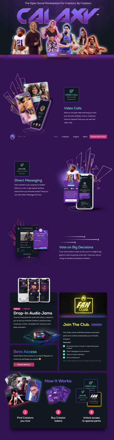
Social networking site homepage has cool graphics
Above the fold does not include a proper CTA but it does have a strong display of social proof by showing a group of celebrities who use the site.
You …
These are samples of high converting home pages. A good home page will make sure to direct users to an action (either continue to articles, or signup their information).
Above the fold does not include a proper CTA but it does have a strong display of social proof by showing a group of celebrities who use the site.
You …
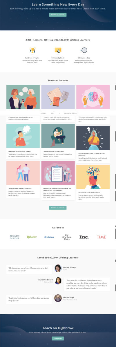
Like any good Email newsletter homepage, it lets the reader know: When they will get the emails, what the emails are about & the estimated read time.
This is simply …
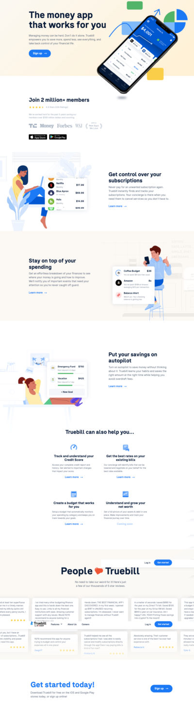
I love headlines with the word “you” !
The sub-headline says exactly “what’s in it for you“: “Truebill empowers you to save more, spend less, see everything, and take …

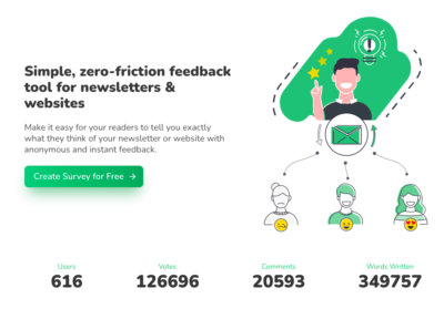
The headline says it all. It is a clear statement of what this app promises to help you accomplish. The happy customers illustration works well with that promise.…
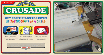
This non-profit website has some really cool illustration and interesting video to accompany the copy.…
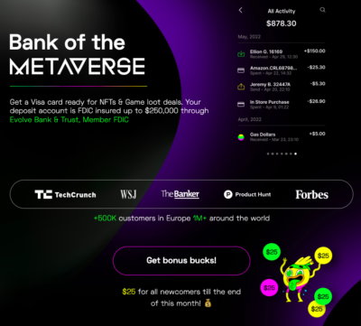
This crypto/NFT startup offers a $25 sign on bonus for a limited time. This gives a sense of urgency.
They also give a generous amount social proof: “FDIC insured”, “…
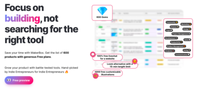
I love the call out graphics that overlay the image. It gives a preview of the type of useful resources you will get from this product. It does a good …
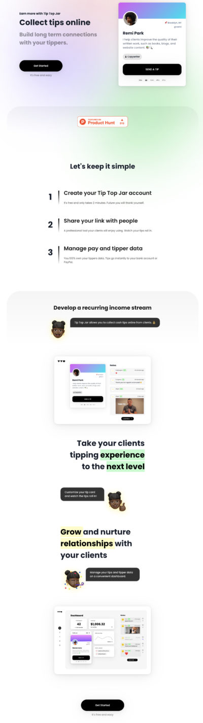
Homepage copy uses simple language to explain their product. They do this well with the 3 step copy telling the user how everything works. In fact they use the word …
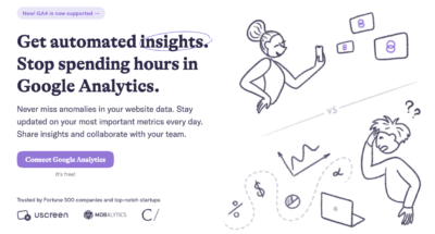
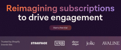
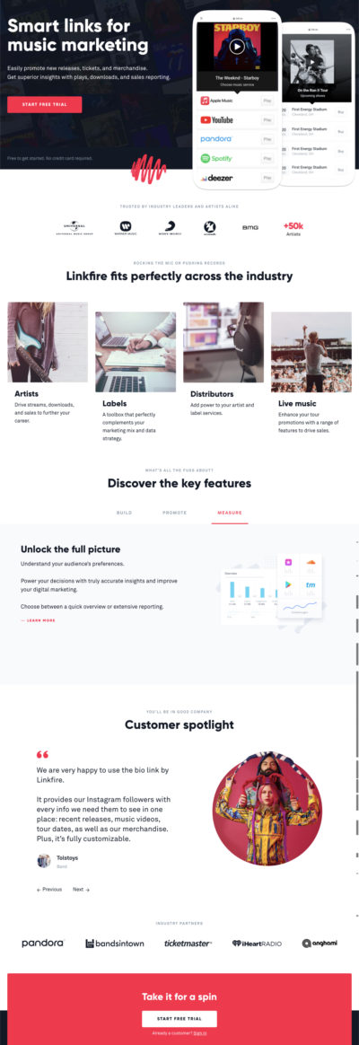
This homepage has all the important elements of a good homepage above the fold.
Why it’s good:
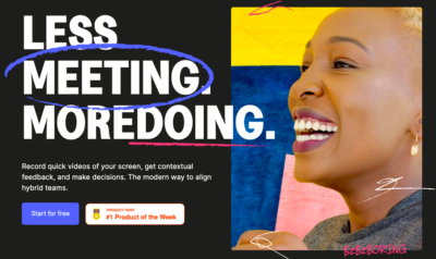
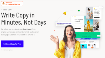
This is a well designed home page featuring a smiling customer. Many marketing experts agree that a smiling face can boost conversion rates.…

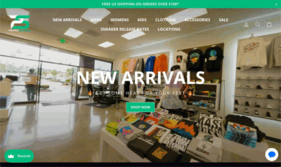
In a world of online scams and counterfeit sneakers the video tour of the store front creates a sense of trust by showing off trust “Yes, we are legit, here …

While you scroll through the features x benefits copy, the left side displays a walkthrough screengrab of the product in action. This definitely brings the copy alive when you can …

The contest theme and web design aesthetic complaint each other exceptionally well and make idea of taking a boring test fun with a touch of nostalgia.…
This is a very clever headline set up. They basically converted what would be a set of bullet points or sub headline copy into a gif to save some web …
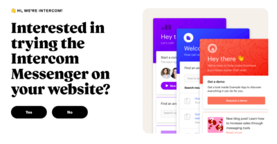
This homepage simply shows the product mockup and uses a clever “yes or no” CTA
When you click “No” it loads a list of articles about the product.
When you …

Good newsletter homepages always give clear expectations:
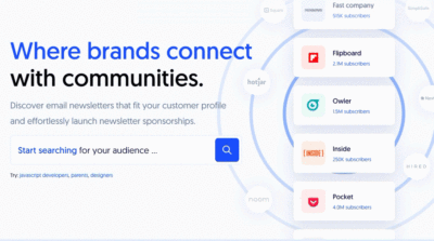
The copy flows well with the animated scrolling list of popular newsletters and there subscriber list.
I also like the search box that links you directly to a signup page …
This brand does a good job showing a demo of product above the fold.
Below the fold, social proof is displayed with big name drops from huge brands in the …