How To Create Advertising That Sells - David Ogilvy Ad

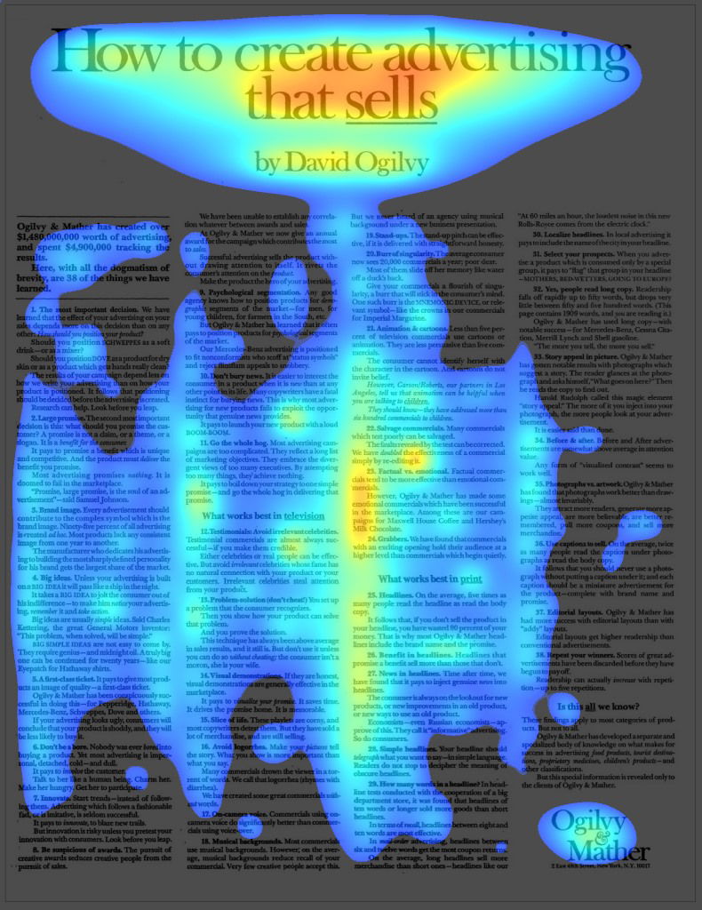
This heatmap of David Ogilvy’s “How to Create Advertising That Sells” is proof that design psychology can do the selling for you. Ogilvy didn’t push his agency; he educated readers, and that generosity built massive trust—and clients came running.
The Visual Funnel of Trust
The heatmap reveals a built-in funnel: headline, subhead, body, logo. Readers naturally flowed through content that delivered value first and brand second. It felt informative, not salesy, which made it all the more effective.
Why It Works
- 77% of attention goes to the big headline
- Subhead screams authority, not hype
- Reads like an article, not an ad
- Transparency triggers reciprocity
- Visual path keeps attention all the way to the logo
Examples
- HubSpot’s free tools generate millions of leads
- Neil Patel’s SEO guides built his reputation
- Basecamp’s open playbook won loyal B2B fans
Analyzed by Swipebot
Loading analysis...
