Bitcoin to Fiat Transfer Graphic
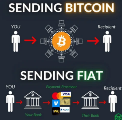
I gotta admit, the Bitcoin community has always had great memes and graphics. This one shows the difference between sending Bitcoin to someone vs a typical Dollar payment.…
Good copywriting is about transmitting information from one brain to another brain, and sometimes IMAGES are better at doing that than copy!
I gotta admit, the Bitcoin community has always had great memes and graphics. This one shows the difference between sending Bitcoin to someone vs a typical Dollar payment.…
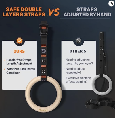
This “Ours vs Other’s” visual on Amazon shows why you should pick THIS product instead of their competitors. A simple image like this could convince someone to end their Amazon …
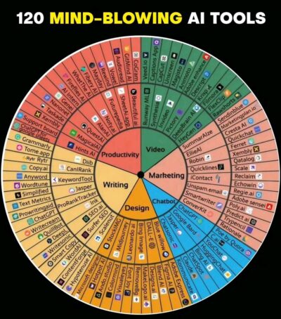
This wheel-style chart breaks down the hundreds of recent AI tools that’ve been coming out.
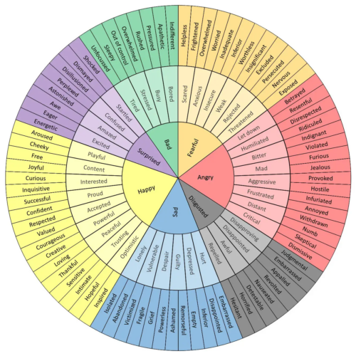
This wheel-chart looks like it was modeled after this Feelings Wheel:
 …
…
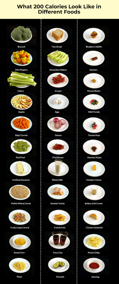
Each dish pictured here is 200 calories….but look at the volume difference of the left column vs right column!
I learned what a calorie was in 2010, and made my …
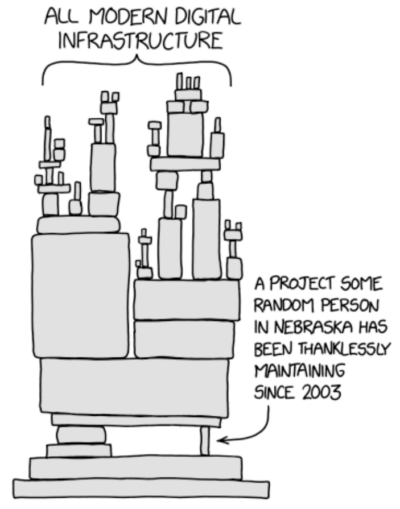
This XKCD graphic came out in 2014 after a small database of code…which happens to secure all the traffic on the internet…went out of date. It showed how dependant modern …
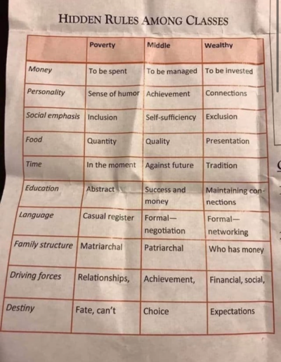
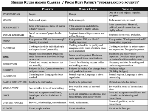
An interesting chart about hidden rules between income classes. This could be used to speak clearer to your target audience.
 …
…
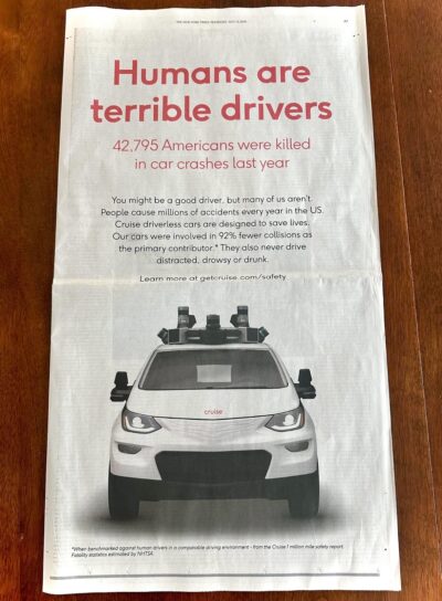
The Chevy Cruise autonomous driving project took out this full page in the New York Times to show how many lives could be saved by letting computers do all the …
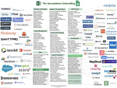
This is a cool graphic showing how the classic Excel Spreadsheet has been un-bundled by many companies. Similar to this Craigslist Unbundling graphing.…

We’ve all ordered “spicy” at a Thai restaurant only to realize it’s TOO SPICY. This helpful chart shows people that even small increases in chili can be vvveerry hot.
This …
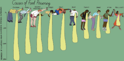
This amazing Causes of Food Poisoning bar chart hilariously demonstrate which foods cause the most cases. This is just so much more fun and engaging than a standard bar chart …
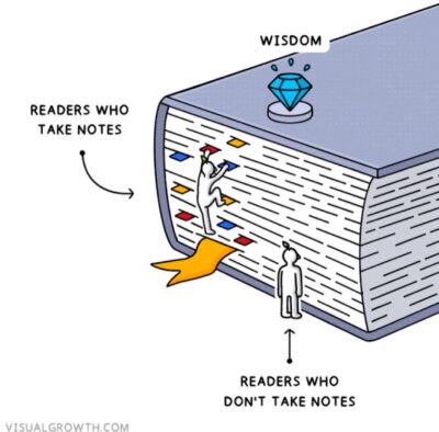
This cool graphic shows that if you take notes you can really retain the wisdom of books you read. I personally take all my notes in Apple Notes now, not …
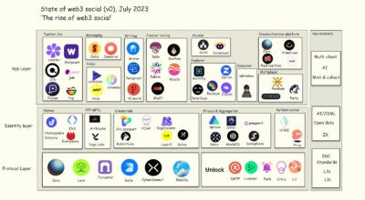
This graph categorizes different companies and where they stand in an industry-wide grand scheme of Web3.
Looking at an industry like this helps see which companies rely on others, and …

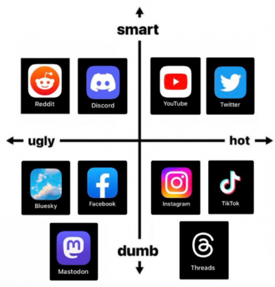
This is an awesome axis-graph which let’s you see where you are on the smart/ugly/hot/dumb scale!
This would be awesome to recreate for your industry.
P.S. I screenshotted this and …

This Instagram ad for a snoring prevention device gives 4 reasons to use their product instead of the standard breathing strip. It also has a curiosity-inducing headline of “Address the …
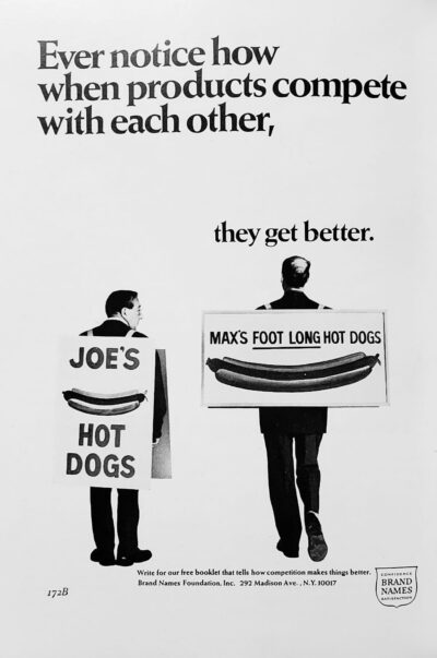
Whose hot dog would you want in your mouth?
Joe’s
-or-
Max’s?
Joe has the same hot dog, but Max is selling it better!…
I love how much data is presented in this one-pager.…
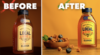
This is a very screen-shottable before/after image that helps promote a free training lead magnet for a product photography course.
I love the use of the ❌’s and ✅’s to …
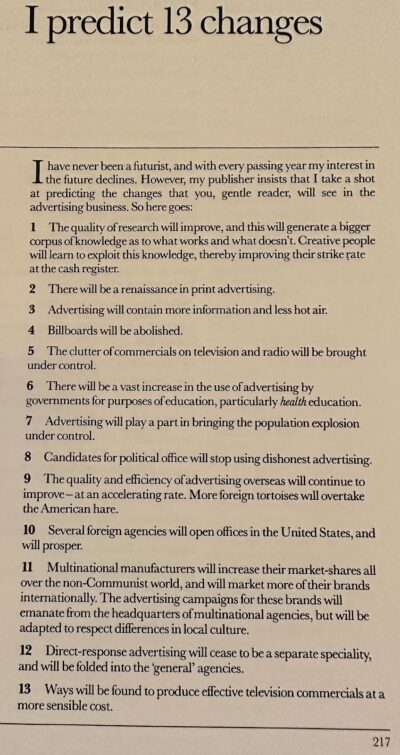
Exactly 40 years ago in 1983 David Ogilvy from the mega-popular advertising book “Ogilvy On Advertising.”
His hand was turned by the publisher to make some “predictions of the future” …
Over the course of 120 years you can see a design macro-trend happen with the Burberry logo: They go from complex design style, to simple, back to complex.…
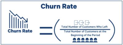
Sometimes in marketing math formulas are used, but they can sometimes be dry or boring.
Instead make them into “Visual Math Formulas” which makes them easier to understand. Here’s 4 …