Search for a command to run...
Ever land on a pricing page and think, “Wait, what am I paying for?” Klaviyo’s pricing calculator kills that confusion...
Polaroid nailed it with this ad. They didn’t sell a camera. They sold the feeling of waiting 60 seconds to...
These jeans don’t whisper “stretchy.” They scream it — with flying kicks, high legs, and 70s swagger. The visual alone...
Chevy didn’t brag about the Vega. Instead, they let everyone else do it for them. This ad is basically a...
Whiskey Tribe’s Patreon page feels straight out of a fantasy game. Instead of boring “tier levels,” they created knight-inspired ranks...
In the 1960s, Kodak nailed product marketing. This ad makes what could’ve been a nerdy tech innovation sound like magic:...
Gatorade’s 1971 ad looks like a science fair project disguised as marketing. It’s filled with lab talk, glass beakers, and...
Nikon nailed social proof with this ad that shows decades of camera models lined up—from the 1954 Nikon S2 to...
This ad for a crypto banking startup hits you with two powerful motivators: “limited time” and “everyone’s already using it.”...
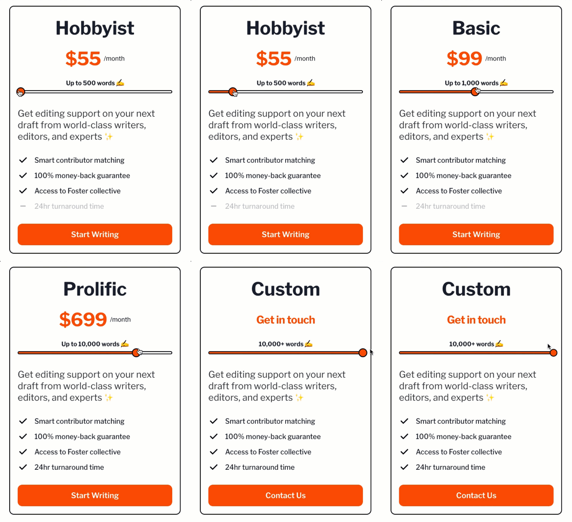
This Foster pricing block nails it. Everything from the slider to the CTA button makes it feel simple, fair, and...
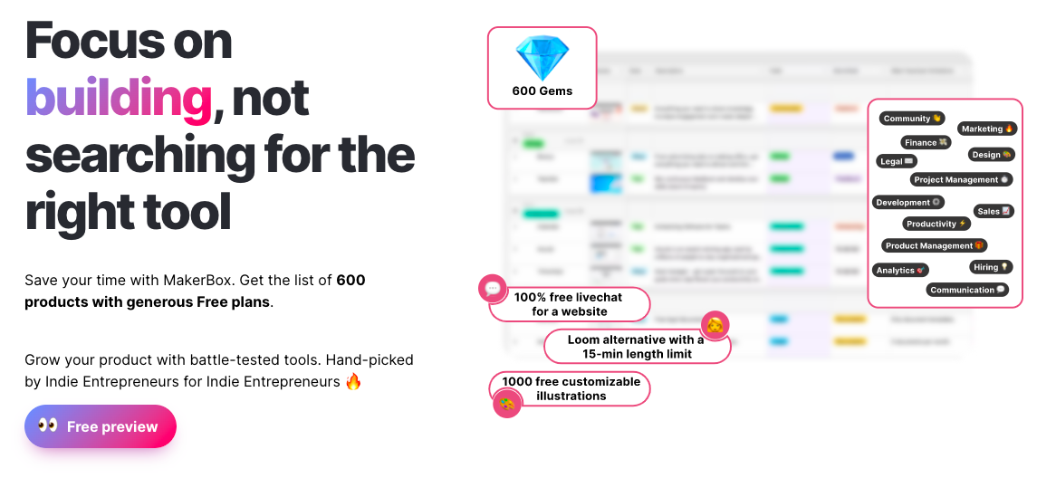
Most spreadsheets look… boring. But MakerBox turns a plain list of tools into something that feels valuable and easy to...
The Tip Top Jar homepage nails the “keep it simple” rule. Everything—from their 3-step setup to their clean visuals—guides you...
Nikon nailed it with this ad: one image, two faces, one unforgettable message. It shows both a bumbling fool and...
This Unbounce homepage nails the first few seconds of a visitor’s attention span. Every element screams clarity, confidence, and conversion....
JC Penney didn’t just make a cheaper polo. They made a wink-and-nod version of the Lacoste shirt — same vibe,...
This vintage Rolls-Royce ad doesn’t shout features or performance. It whispers class. The car isn’t the focus — the lifestyle...
This pricing page nails the SaaS trifecta: clarity, comparison, and conversion. Each tier has a catchy name, a clear customer...
Unbounce nails the landing page formula with a clean headline, simple layout, and a touch of personality—a smiling customer GIF....
Most people didn’t believe a camera this small could take good pictures. Kodak’s copywriters didn’t dodge that doubt—they hit it...
Most software sites focus on features. Thrive Suite focused on who those features help. Their “Use Cases” page breaks down...
Ever think you need a pro designer for your ad? Hopper proves you don’t. Their Instagram ad was literally a...
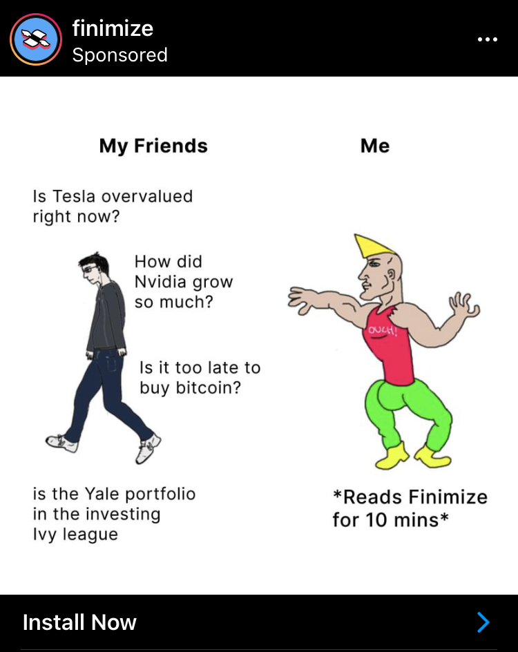
Finimize nails a classic visual formula: confused newbie vs. confident pro. But instead of using a fancy design, they use...
Finimize nails this ad. It promises massive value (8 hours of research) for a tiny time cost (10 minutes). That’s...
FeedLetter nailed the testimonial game. Instead of just dumping quotes on a page, they built a visual “Wall of Love”...