The Order of Time
Updated on
00:00
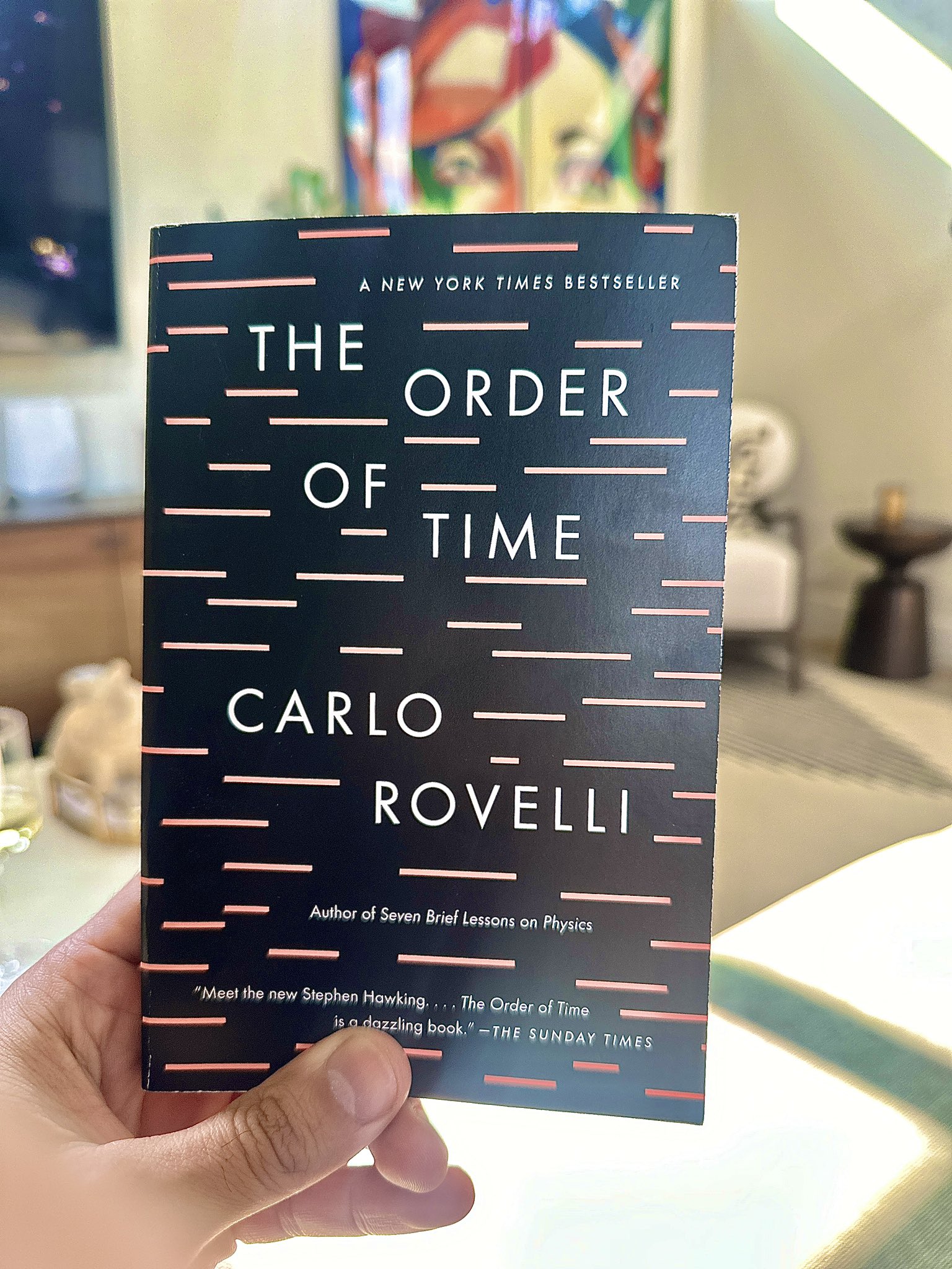
This book cover does more with less. Just black background, thin lines, clean typography—and yet it instantly feels premium, smart, and calm. It’s a physics book that looks like… well, physics.
Marketing Analysis
The design uses repetition and spacing to mimic the concept of time passing. The lines look like ticking moments or data points in motion. The typography is balanced and modern, signaling sophistication while being totally approachable. Even the blurbs are minimal, letting the title do the talking.
Why It Works
- Simplicity screams confidence
- Negative space draws attention
- Visual metaphor (lines = time) makes it memorable
- Consistent tone between subject and design
- Feels intellectual but not intimidating
Examples
- Apple packaging: minimal, bold, instantly premium
- The Economist ads: clean layouts that reflect authority
- Google homepage: one box, infinite possibilities
- Tesla website: sleek design mirrors futuristic tech simplicity
Analyzed by Swipebot
Loading analysis...
