David Todva Freelance Writer With Portfolio On Weebly
Updated on
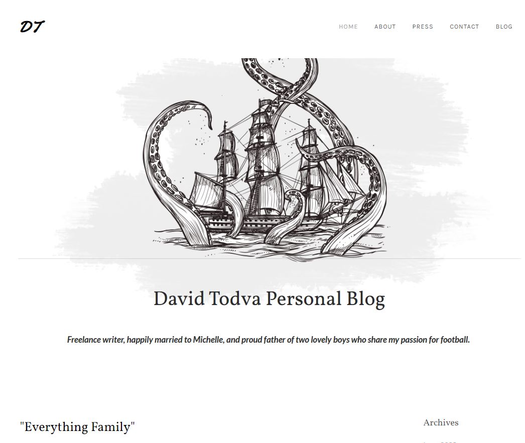
David Todva’s blog homepage nails simplicity and focus. A clean white background, a sketch of a ship caught by tentacles, and his name centered boldly—it instantly tells a story.
Marketing Analysis
This design shows how visuals and copy work together. The ship illustration draws curiosity, while the minimal layout directs eyes straight to David’s name and tagline. No clutter, no confusion—just a brand story in one glance.
Why It Works
- Uses strong visual storytelling (ship = adventure, creativity)
- Clean hierarchy: name → tagline → content
- Consistent typography adds trust and professionalism
- Personal touch (“father of two…”) builds relatability
Examples
- Medium’s clean layouts highlight authors over design.
- Squarespace templates focus attention on single hero visuals.
- Apple’s homepage uses white space to make one product pop.
Analyzed by Swipebot
Loading analysis...
