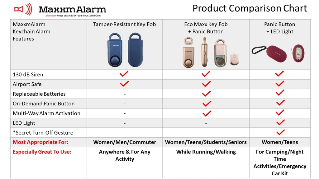
Ever tried explaining product differences in words… and watched eyes glaze over? This chart from MaxxmAlarm shows exactly why pictures (and checkmarks) beat paragraphs. One glance, and you can tell which alarm fits your needs.
Marketing analysis
Visual comparison charts simplify complex choices. Instead of telling customers what’s better, this layout shows it. Each feature is lined up, every benefit visible, and there’s zero guesswork.
Why it works
- Reduces cognitive load with clear visual structure
- Uses checkmarks to create instant understanding
- Helps customers self-select what fits their situation
- Builds trust through transparency
- Keeps focus on customer benefits, not product jargon
Examples
- Apple’s product comparison tables make choosing devices simple.
- Tesla compares Model 3 trims by range and performance.
- SaaS brands like Mailchimp or HubSpot use tier charts to show plan value instantly.
Analyzed by Swipebot
Loading analysis...
