Landing for shopper rewards app has everything but a testimonial
This Smile.io referral landing page checks nearly every box. Strong headline, clear CTA, benefits, visuals, and an irresistible e-book offer. It nails structure and flow, getting visitors to scroll and engage. But there’s one big gap: social proof.
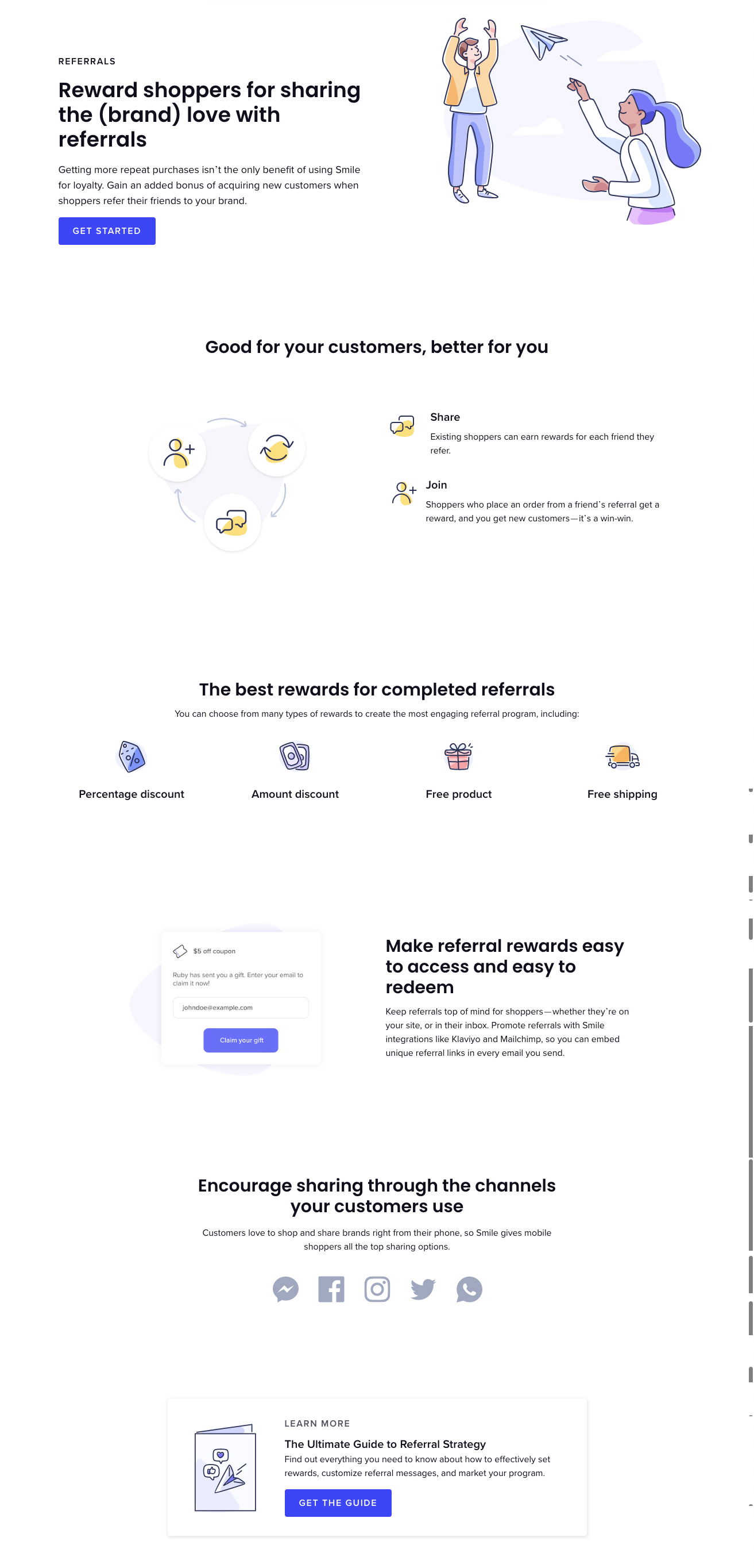
Why it works
- Headline clarity: Explains the full product in one glance.
- CTAs everywhere: Top, middle, bottom—all paths lead to conversion.
- Visual storytelling: Icons and illustrations make benefits digestible.
- Lead magnet: Offers extra value for deeper engagement.
- Missing element: No testimonial = lower trust conversion bridge.
Real-world examples
- Dropbox boosted signups 60% with referral incentives.
- Airbnb leveraged customer quotes to double trust in bookings.
- Slack’s homepage highlights testimonials from real companies.
- ConvertKit added social proof and saw a 30% jump in trial signups.
Analyzed by Swipebot
Loading analysis...
