109 Landing Pages Examples
Discover landing pages that convert with our curated examples. Learn design, copy, and CTA strategies that lead to higher engagement and sales. Ideal for digital marketers, advertisers, and anyone involved in conversion optimization.
Most Popular in Landing Pages

Target Homeowners in High-Tax States
If you help people save money on housing costs, this property tax map is your treasure map. It doesn’t just...

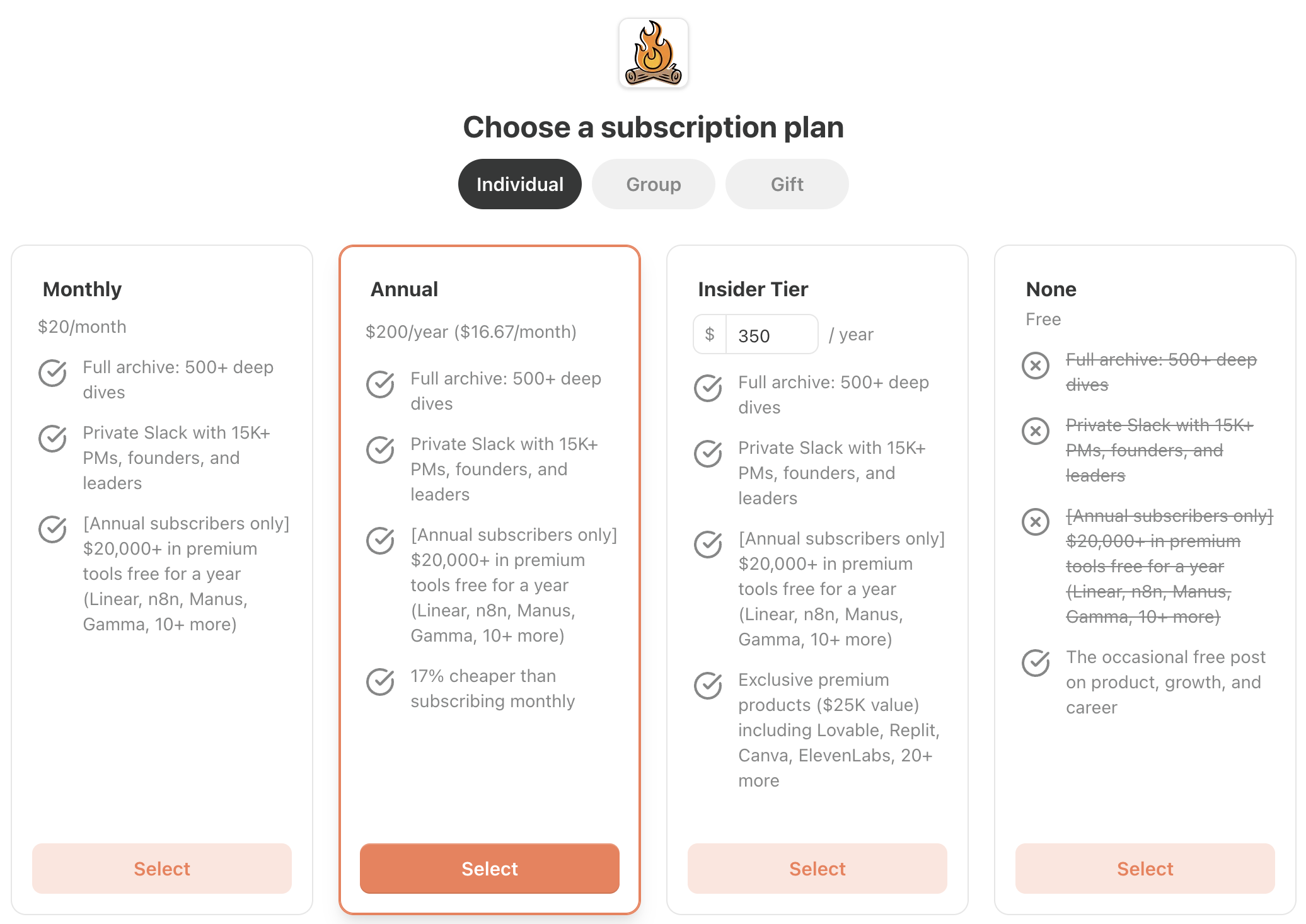
Basecamp's Four Tiers Simplify Buying Decisions
Basecamp’s four-tier pricing screen is a masterclass in making decisions feel easy instead of overwhelming. One glance at the layout...

Watch Testers Talk Out Loud To Boost Conversions
Nothing gives you a full‑body headache like a low‑converting website. This meme ad nails it: migraines, hypertension, stress… and then...

Paste Your Website, Auto-Generate Qualified Leads
Most lead-gen tools feel like setting up a nuclear power plant just to turn on a lightbulb. Money Printer flips...

Ship Imperfect Offers, Iterate Quickly
That dartboard image nails it. One board is spotless after “10 hours of thinking.” The other is full of holes...
Our $100K Client Reach-Out Tactic
Most people send a sad little cold email and pray. Our clients send a full-blown mini campaign that looks like...

Own Google with a Two-Word Domain
In the reel, you see a relaxed founder in a San Francisco office, drink in hand, with a bold overlay:...

Customer-Proven SEO That Drives Traffic
Most SEO advice is written by marketers talking to other marketers. Ahrefs flips that by handing the mic to the...

What AI Founders Actually Use to Build
Most AI founder pages scream features. This one quietly asks, How can I blow your mind? Then it walks you,...

Highest performing before/after ad for a large piano learning company
Play Any Song By Ear In 40 Minutes is the anti-traditional piano method. The image says it all: on the...

Subscribe, Claim $25K In SaaS Credits
This landing page turns a simple newsletter subscription into a $25,000 product bundle. Every inch of the page screams: subscribe...

Stack Value To Convert Free Readers
If you want free readers to finally pull out their wallets, copy what Lenny does on his pricing page. He...

We shall build good ships here; at a profit if we can, at a loss if we must, but always good ships.— Collis Potter Huntington

Nathan Barry: Get Pre-Orders Before You Build
In the image, a relaxed founder sits on a couch, coffee in hand, with big bold text above his head:...

Make Your Book Launch Run Itself
Most authors treat launch week like a frantic circus: interviews, posts, DMs, begging people to buy. The image above flips...

$1.8 Billion company and this is their entire website
This hero section doesn’t sell features. It sells entry into a room you’re probably not allowed in. The dark background,...
The way to get started is to quit talking and begin doing.— Walt Disney

Gumroad’s “Small Bets” Makes Starting Simple
Most landing pages sell you a dream of overnight success. Not Gumroad. Their “Small Bets” page promises something way more...

Crafting Impactful Visuals: Lessons from a Minimalist Design
This landing page nails the art of saying a lot with very little. Just a bold statement, some numbers, and...

Hampton Storytelling About Page
Most About pages feel like a stiff LinkedIn summary. But Hampton’s page flips the script. It tells a story —...

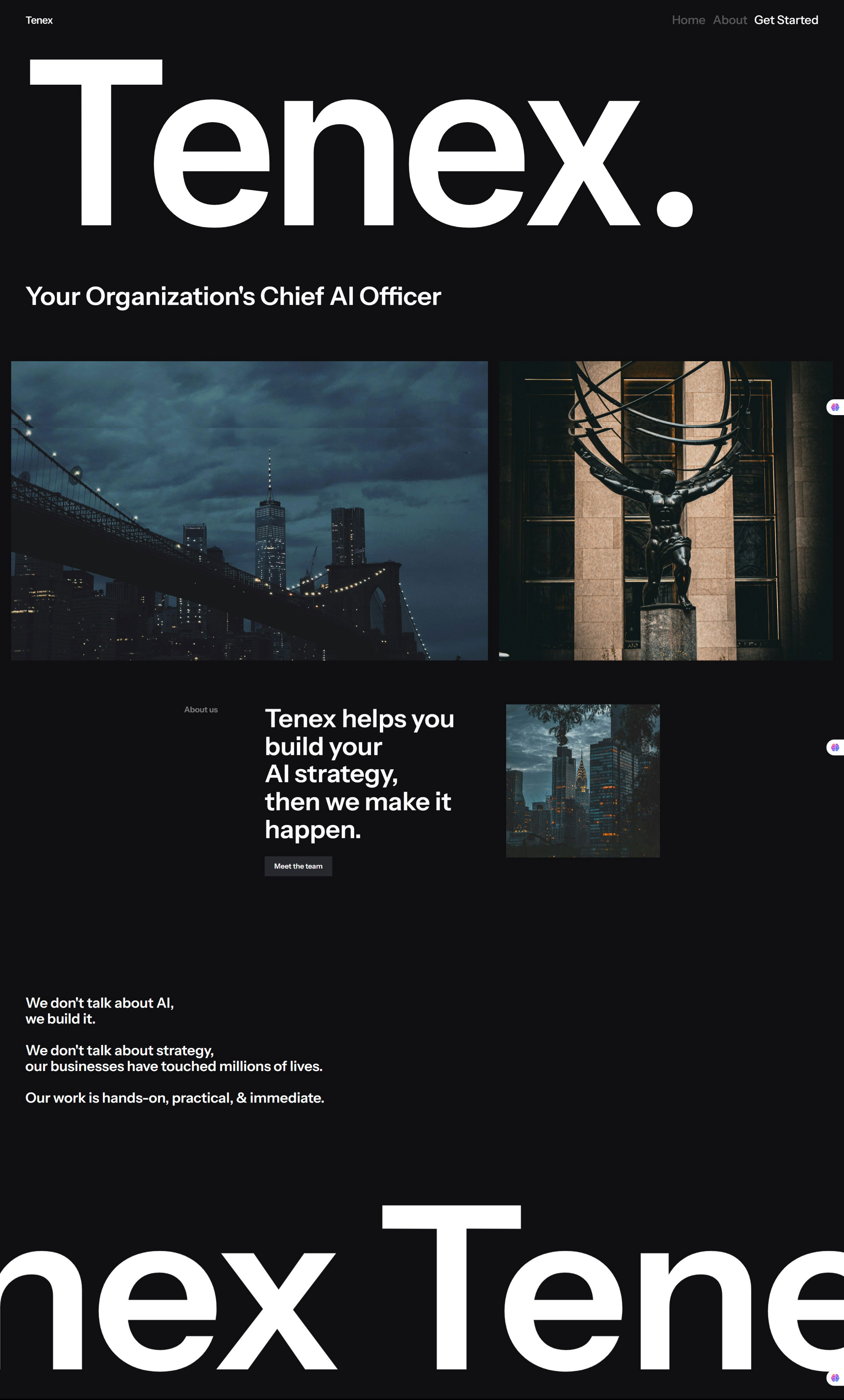
Tenex Homepage
Most AI websites look the same: stock robot images, buzzwords, and corporate fluff. Then you land on Tenex — black...

Icon's "How AdGPT works" section
AdGPT’s explainer section is a mini masterclass in landing page clarity. In just four steps, it turns something complex (AI...

Wallet Opening Words Landing Page
This “Wallet Opening Words” sales page is like a confetti cannon for your eyeballs. It’s loud, fun, and bursting with...

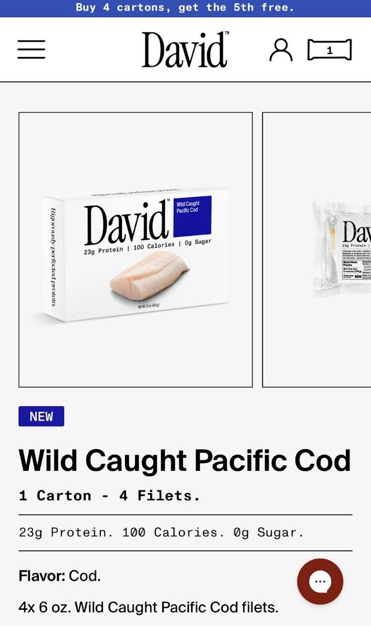
Next protein trend is…..cod fish??
David, known for protein bars, just launched… fresh cod. Yep, the same bold logo and clean packaging—but now with raw...