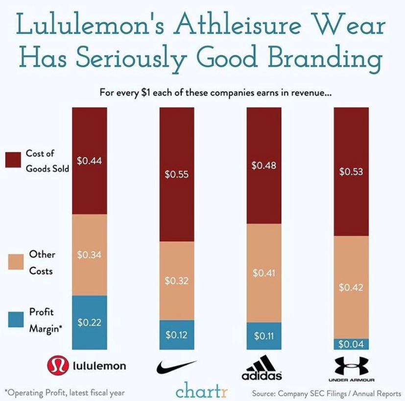
This chart nails it. It turns dry financial data into an “aha” moment. Lululemon earns twice the profit per dollar compared to Nike and Adidas, all by selling yoga pants at premium prices.
Marketing Analysis
Lululemon isn’t making cheaper stuff. Their “cost of goods sold” is similar to the others. The profit difference? Branding. They’ve positioned their gear as high-status, lifestyle-defining products—not just clothing.
Why It Works
- Strong brand identity means higher perceived value
- Community-driven marketing builds loyalty (hello, yoga tribe)
- Consistent premium pricing reinforces exclusivity
- Emotional connection > functional benefit
Examples
- Apple sells iPhones at 40%+ margins by owning “status tech”
- Starbucks sells $6 coffee via lifestyle branding
- Patagonia sustains premium pricing through mission-driven storytelling
Analyzed by Swipebot
Loading analysis...
