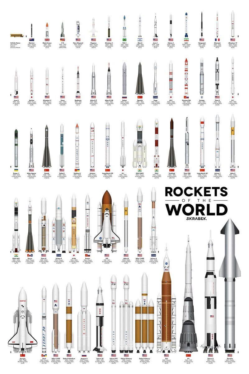
This amazing graphic shows rockets from all over the world side-by-side. Each one represents years of engineering, iteration, and competition. Looks cool — but it’s also a killer marketing metaphor.
Marketing Analysis
Each rocket is basically a brand. Different designs, same goal: reach orbit. The lesson? There’s no one “right” way to succeed. It’s about testing, learning, and improving until you build something that truly scales.
Why It Works
- Visual comparison makes complexity easy to grasp
- Shows diversity and evolution — progress sells
- Side-by-side layouts create curiosity and engagement
- Visual variety demonstrates innovation and credibility
Examples
- Apple’s product lineup comparison charts
- Tesla’s evolution of models timeline
- Nike’s sneaker history posters
- Coca-Cola’s vintage bottle lineup campaign
- SpaceX’s rocket evolution infographic
Each tells a story of progress — and progress sells.
Analyzed by Swipebot
Loading analysis...
