Self Driving Vehicle White Paper Signup Form
Updated on
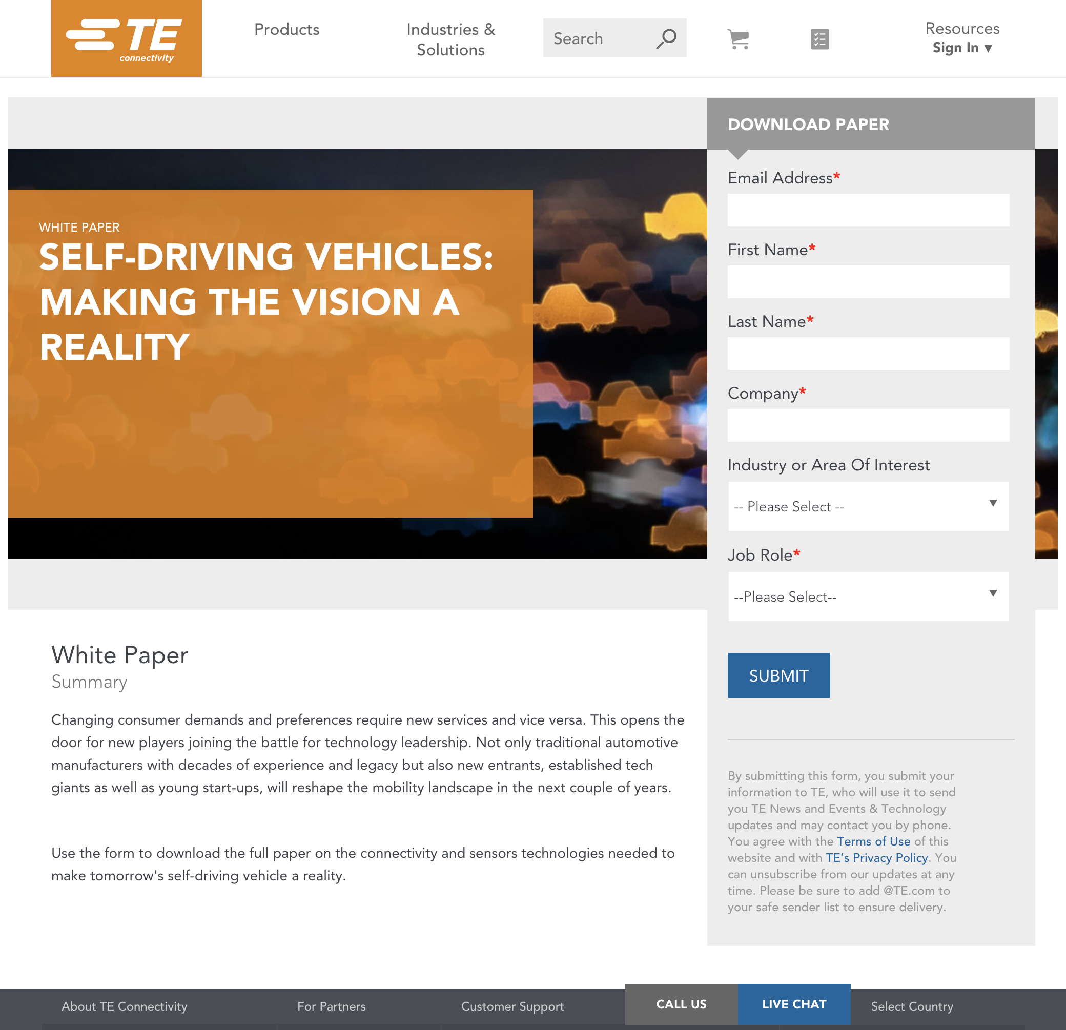
This white paper signup form from TE Connectivity isn’t pretty, but it works hard. It’s got one job: get people to fill it out. And it does that by removing every possible distraction.
Marketing Analysis
The big orange header grabs attention first. Then your eyes slide to the right where the form sits—easy to find, easy to fill. Every field feels necessary, not optional fluff. There’s no extra text, pop-ups, or fancy animations.
Why It Works
- Familiar layout lowers friction
- High-contrast header and CTA guide focus
- One clear action: “Download Paper”
- No competing elements stealing clicks
Examples
- IBM’s cloud reports use near-identical gated forms
- Deloitte’s insight pages follow this same clean layout
- HubSpot built early mailing lists with this exact minimalist setup
Analyzed by Swipebot
Loading analysis...
