This vintage Campbell’s ad is a masterclass in saying everything… without saying anything. Two kids, a can of soup, and some smart layout magic. That’s it. Yet your eyes instantly know the brand and the product.
The Visual Flow Trick
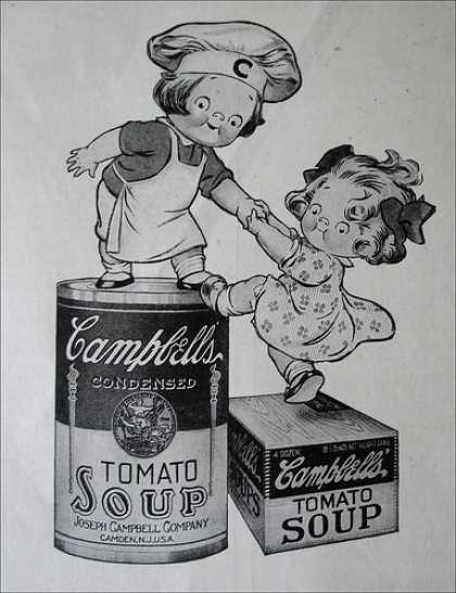
Your gaze starts with the kids’ faces. Then one reaches out—and boom!—your attention goes straight to the Campbell’s label. White space frames the product perfectly, making it pop like a spotlight on stage.
Why It Works
- Faces grab attention faster than headlines
- Movement guides the eye to the brand
- Clean layout means zero confusion
- Contrast pulls the can to the front visually
Real-World Examples
- Apple: isolates products with white space
- Lego: uses playful motion to drive focus
- Coca-Cola: bold color dominates first glances
Analyzed by Swipebot
Loading analysis...
