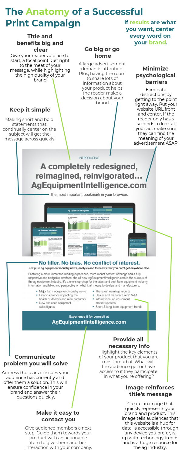
This visual breakdown nails what makes a print ad succeed: clarity, focus, and a strong call to action. It’s not about fancy design tricks—it’s about guiding the reader’s eye and brain toward one goal: understanding your offer fast.
Why This Template Works
- Big headline = instant clarity. Readers know what it’s about in seconds.
- Short copy = faster decisions. Less fluff keeps attention.
- Visual tie-in = message reinforcement. Image tells the same story as text.
- Clear CTA = easy next step. No confusion about what to do next.
- Trust signals = confidence boost. Phrases like “no bias” build credibility.
Real-World Examples
- Apple ads: simple product shots + one bold headline.
- Nike print spreads: minimalist design directing all focus to the slogan.
- HubSpot brochures: pain-focused headlines (“Stop Losing Leads”) followed by clear CTAs.
- Mailchimp campaigns: playful visuals that match the friendly messaging.
Analyzed by Swipebot
Loading analysis...
