About page for cashback app that sells
Most “About” pages are snooze-fests. Ibotta’s? It’s practically a sales funnel in disguise. Every section sells, reassures, and nudges you closer to that “Sign up” button.
Marketing analysis
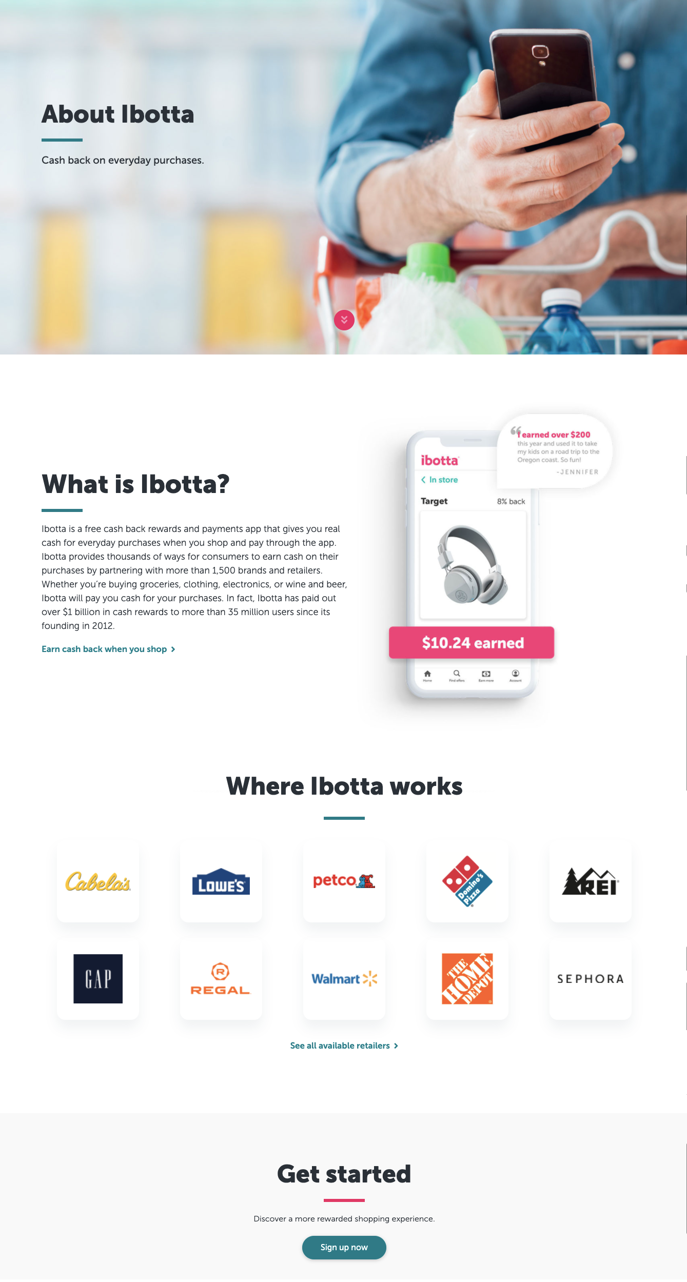
Right off the bat, the page shows the product in action — someone actually using the app. Scroll a bit and you see social proof embedded inside the product mockup, logos from familiar retailers, and CTAs at the top and bottom to catch anyone ready to act.
Why it works
- Visuals create “ownership” — users imagine earning cashback themselves
- Mini testimonial builds instant trust
- Retailer logos = built-in credibility
- Multiple CTAs = more chances to convert
- Clear, benefit-first headline hooks the reader
Examples
- Dropbox uses friendly visuals to show collaboration “in action.”
- Shopify sprinkles testimonials and brand logos throughout its homepage.
- Duolingo’s “About” doubles as a conversion path with CTA buttons and proof points.
Analyzed by Swipebot
Loading analysis...
