
This simple chart conveys Apple's multiple sources of revenue over time, all in an extremely easy color coded chart.
This image takes pages of financial data and makes it simple to consume!

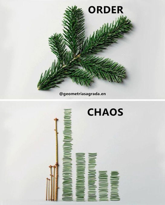
This is a cool visualization of an assembled plant in complete order, but then disassembled it looks like just random...
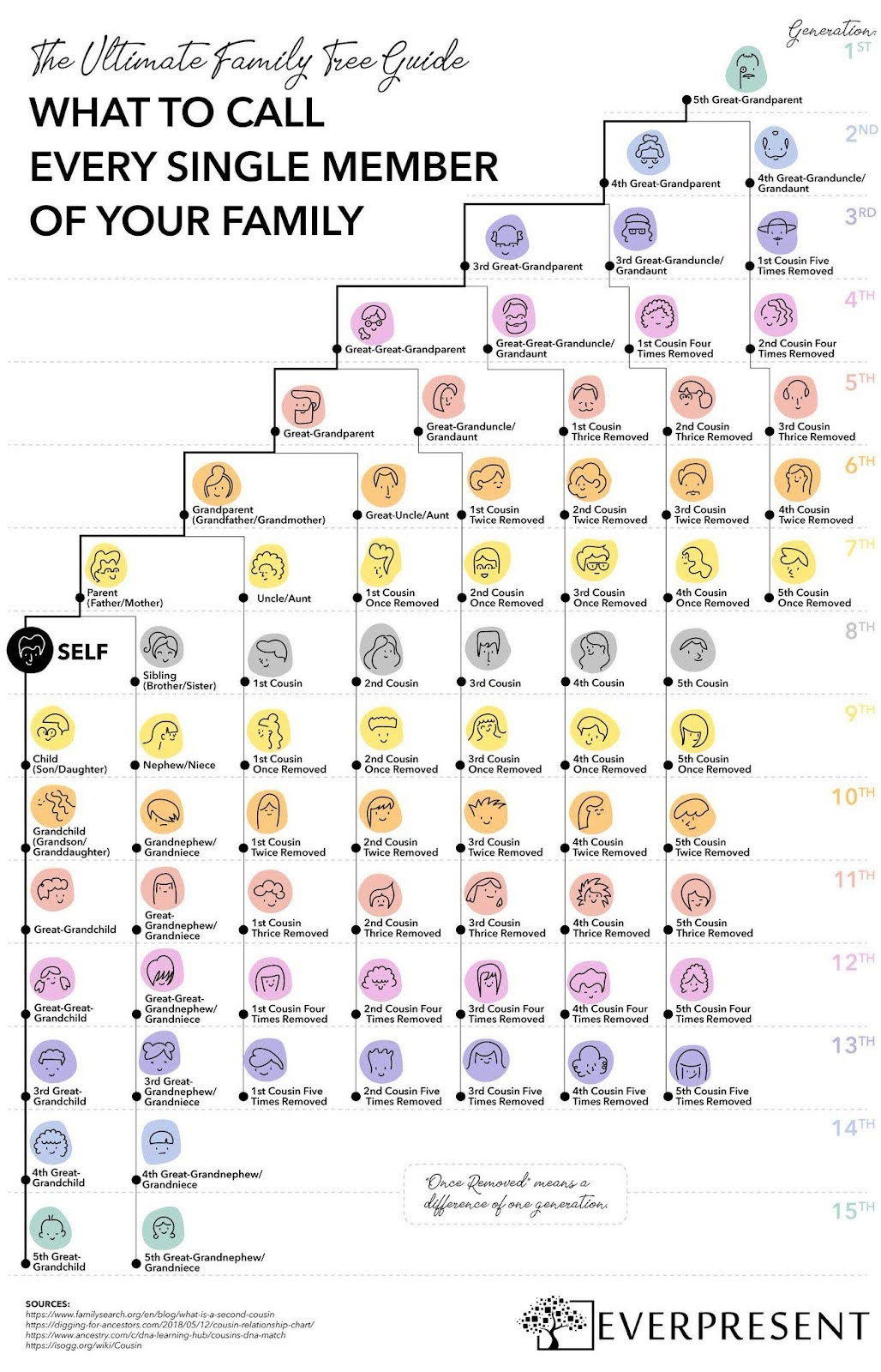
This colorful one-pager breaks down what to call every single family member—across 15 generations.
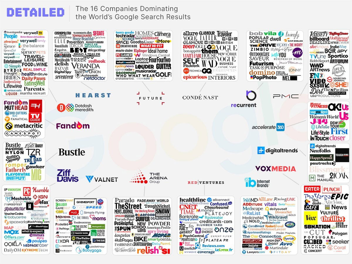
This image shows how 16 main brands control the SEO on google. Why I think the review industry sucks:basically 16...
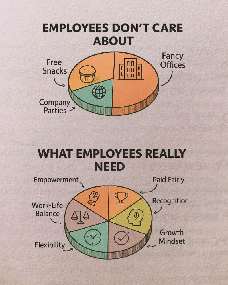
What employees really care about — and what companies keep getting wrong.

This graph illustrates the number of downloads needed to rank #1 on the app store.app store.

This is a pretty cool graphic that shows the progression of how the Tesla headlights look from 2012 all the...
Search for a command to run...