1,181 Data Examples and Graph Examples
From analytics to consumer insights, see how data-driven decisions lead to successful campaigns. Essential for marketers, analysts, and business strategists.
Most Popular in Data

Make Every Insight Actionable With Engagement Analytics
Most dashboards answer questions nobody asked. This Instagram creative flips that: the entire screen is nothing but the questions creators...

Turn Your Email List Into Revenue Engine
Most people treat their email list like a dusty address book: nice to have, rarely opened. The Kit screenshots flip...
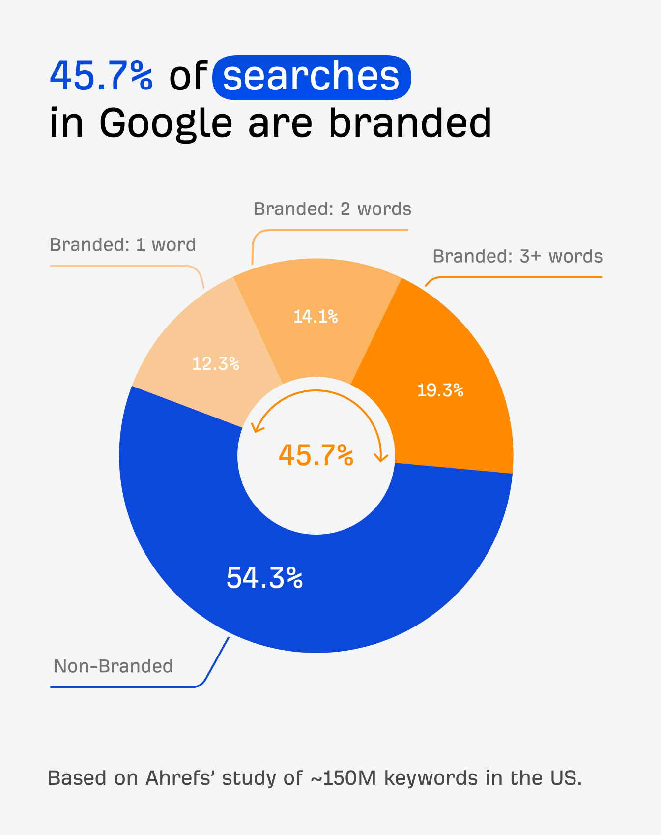
Make Branded Searches Your Biggest SEO Win
Everyone obsesses over ranking for generic keywords like “best CRM” or “email marketing tools.” But the chart from Ahrefs’ latest...
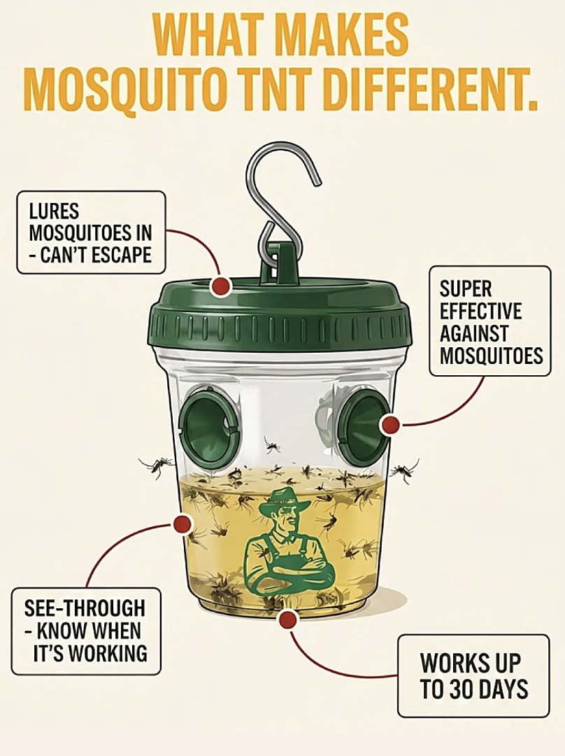
Sell With Proof: See-Through Mosquito Trap
If your product actually works, show it working. This mosquito trap ad doesn’t brag with fluffy claims, it rubs your...
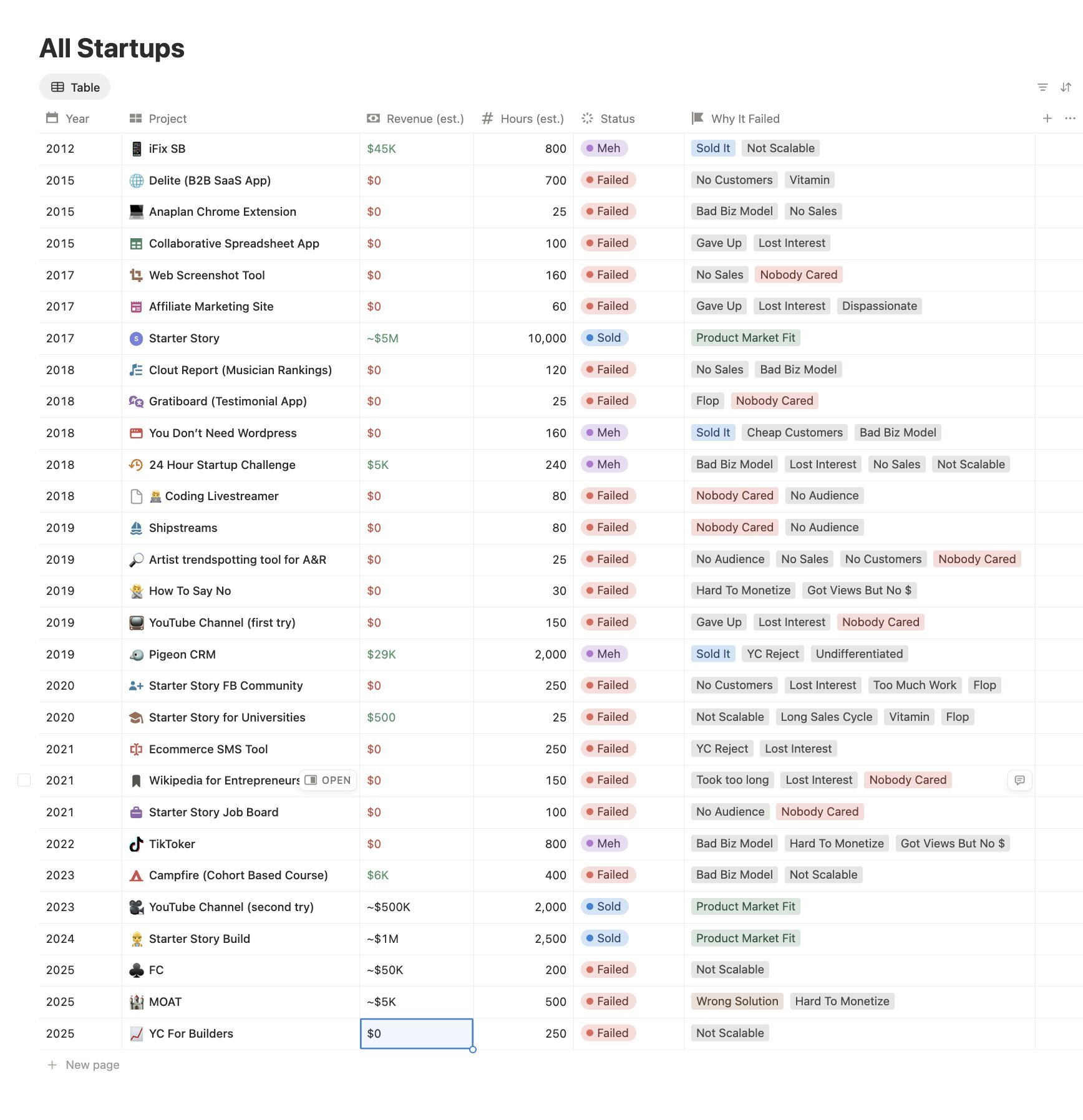
No Customers, Bad Model: Startup Failures
This Notion table is a graveyard of startup attempts: 26 projects across 13 years, most with $0 revenue and a...
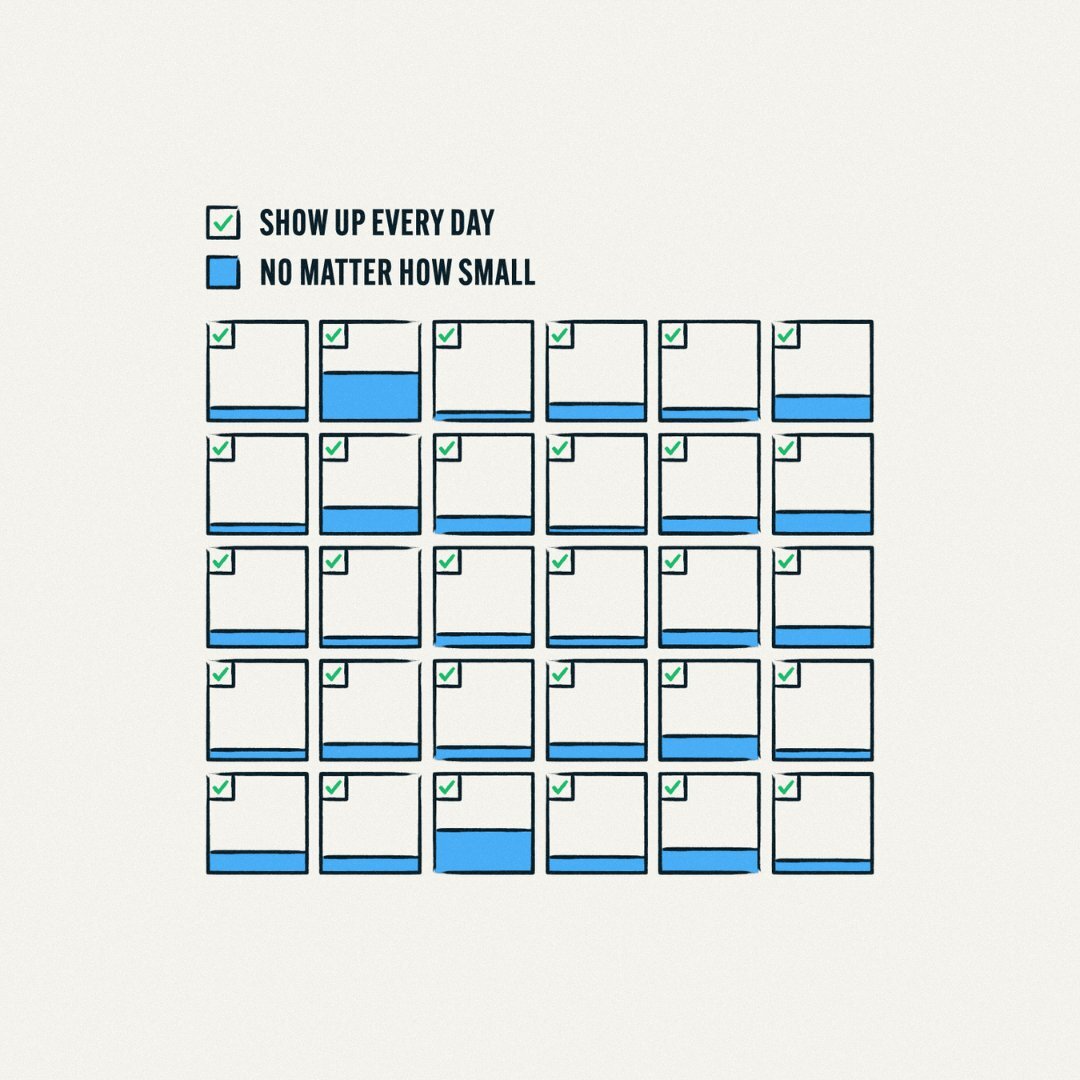
Ship Micro Wins Every Single Day
The image is stupidly simple: a month of little squares, each with a tiny green check and a blue bar...

Most Billion-Dollar Brands Started After 35
If you think you’re “too old” to start a massive company, this chart should punch that thought in the face....
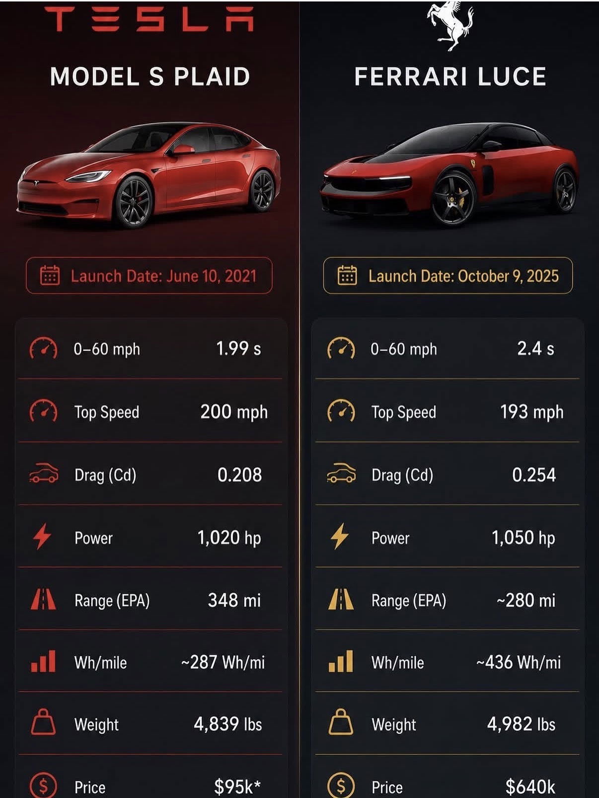
Tesla Plaid: Ferrari Performance at 95k
This side‑by‑side image is brutal: a Tesla Model S Plaid staring down a Ferrari Luce like a budget assassin. Same...

Let AI Pick Your Top Performing Emails
You don’t need another spreadsheet to find your winning emails. You just need to ask your AI. The screenshot from...

AI's Jevons Paradox: More White Collar Jobs
Zoom grid of four serious faces. Big white text: “E257 – Jan 9, 2026” and “demand.” That single frame from...
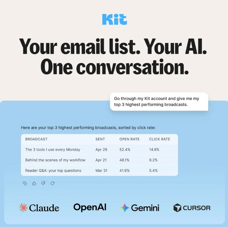
AI Finds Your Top 3 Email Broadcasts
AI Finds Your Top 3 Email Broadcasts is basically the screenshot you’re looking at, turned into a superpower. One quick...

Install PostHog With One AI Prompt
Installing analytics used to feel like gardening with a spoon: slow, messy, and weirdly painful. PostHog flipped that on its...

Market to Kids Who Can't Roam Alone
That chart is a gold mine. It shows American kids basically living inside invisible fences: at age 10, only 2%...
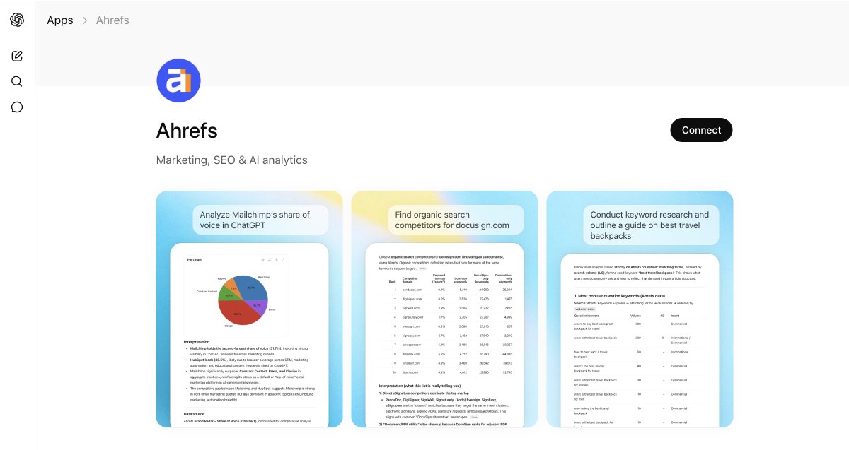
Turn Ahrefs Data Into Instant ChatGPT Dashboards
Most SEOs sit on a goldmine of Ahrefs data, but still stare at static reports like it’s 2014. The new...

From $4B To $900B: Anthropic's Valuation Surge
That chart looks fake at first glance. Anthropic’s valuation goes from a tiny blue sliver at $4.1B to a screaming...
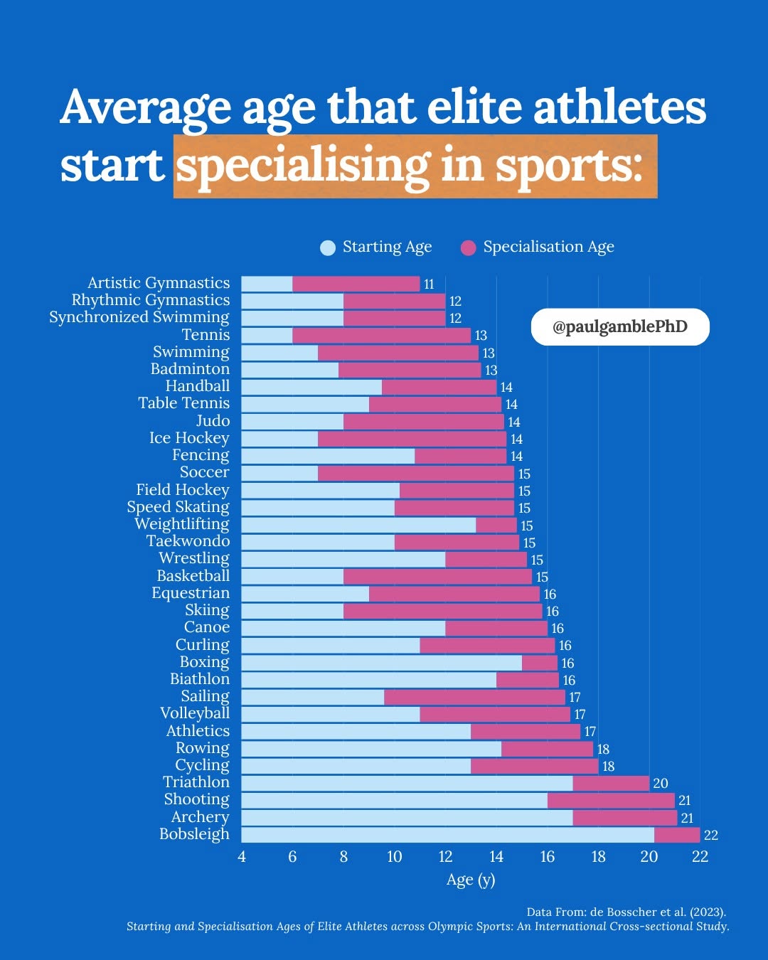
Most Elite Athletes Specialize in Mid-Teens
Parents think the path to the Olympics starts at age four with private coaching, year‑round leagues, and no off‑season. This...
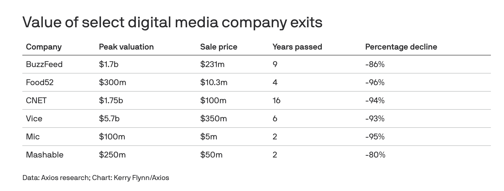
Cash Out Digital Media While It's Hot
Digital media valuations used to be rocket fuel. The chart here is what happens after the rocket runs out. Once-hyped...
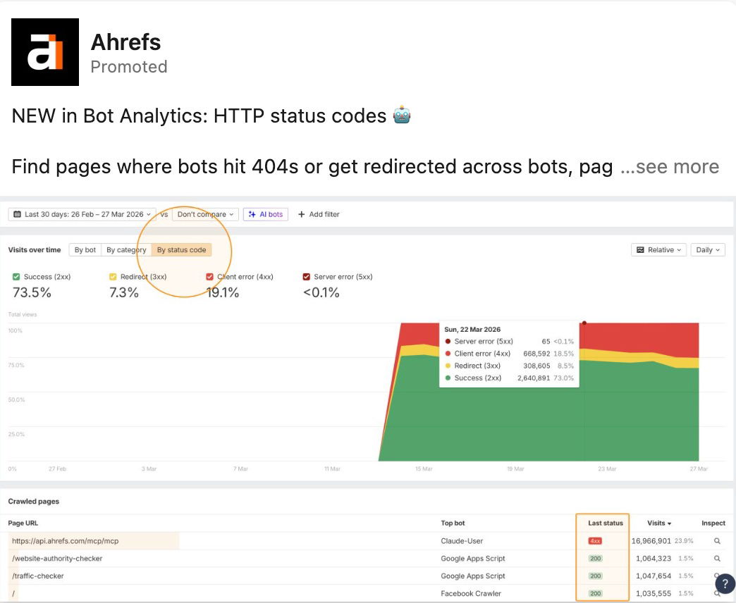
Fix Bot Crawl Issues with HTTP Status Codes
If Googlebot keeps face-planting into 404s on your site, you don’t have an SEO problem, you have a status-code problem....
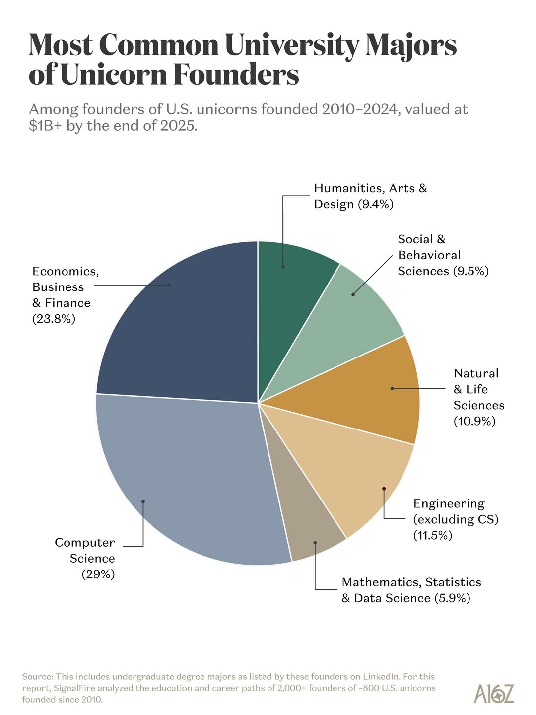
Majors That Produce Unicorn Founders
Everyone thinks every unicorn founder was a dropout hacker in a hoodie. The chart in this Instagram post blows that...

Mine PubMed For Billion-Dollar Drug Ideas
That blue PubMed screen in the image looks boring on purpose. It’s a government website, not a pitch deck. But...
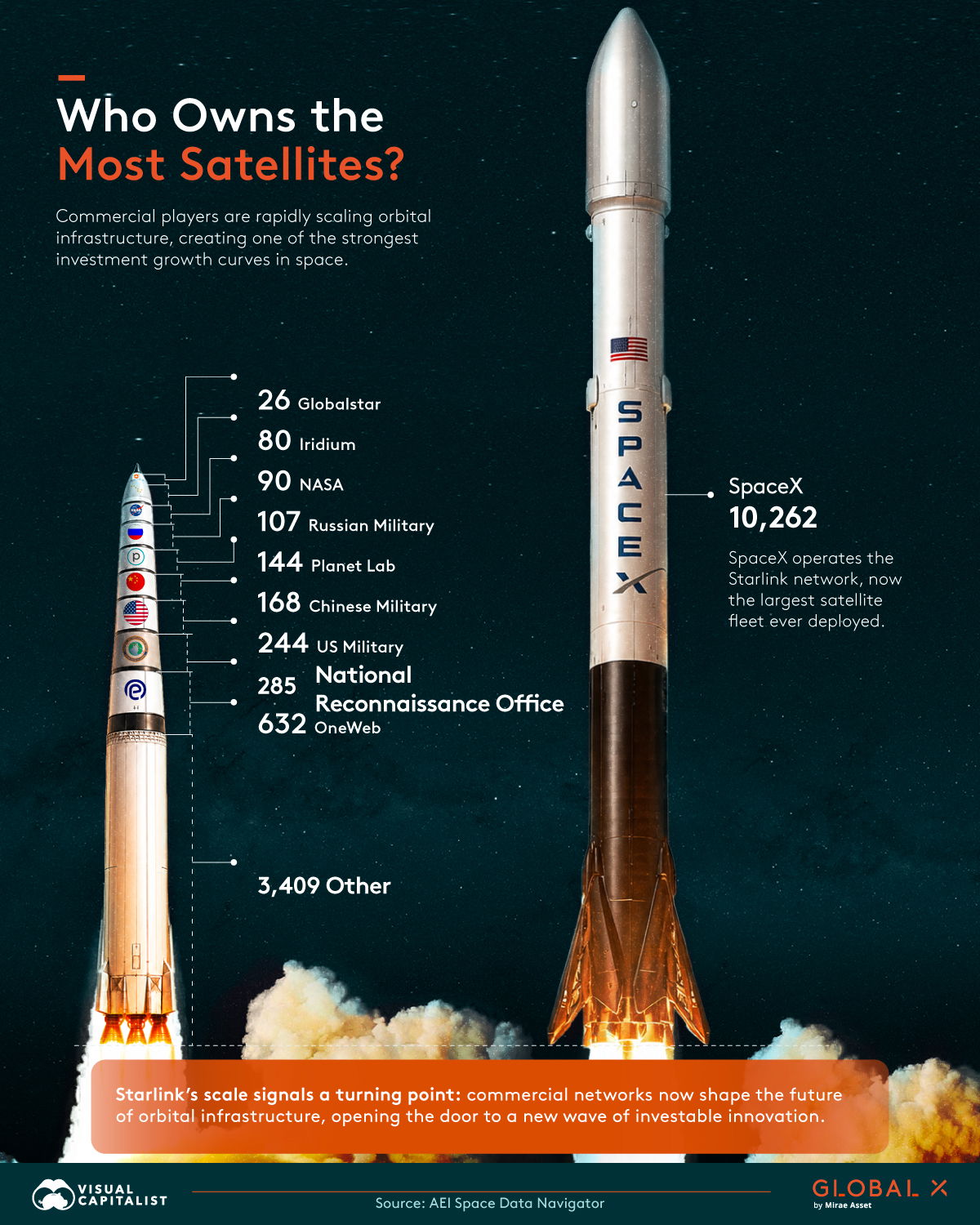
SpaceX Owns Orbit: The Investment Play
Look at this chart and forget every polite thing you’ve ever heard about “competition” in space. SpaceX isn’t competing for...
Revenue is vanity, profit is sanity.

Where VC-Backed Founders Went To School
If you’ve ever wondered where VC-backed founders actually went to school, this chart from a16z and PitchBook lays it out...

Startup Timelines: Idea to PMF Benchmarks
Every founder secretly wants PMF in six weeks. Then reality shows up with a 2‑year timeline and a bat. This...