Bad Vet Billboard Example
Updated on
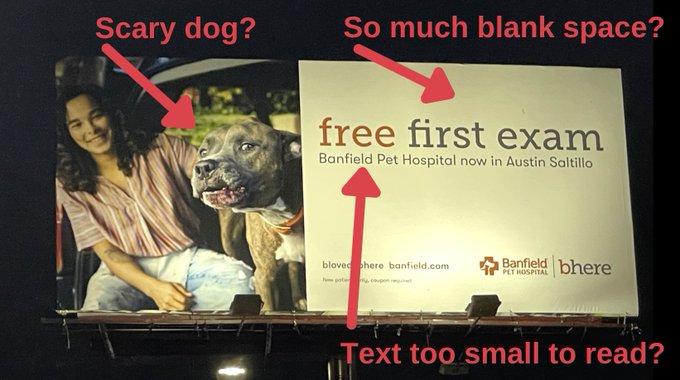
This billboard fails the #1 rule of outdoor ads: be instantly clear. You could drive by 100 times and not realize it’s for a pet hospital offering a free exam.
What Went Wrong
The photo’s confusing, the text is too small, and half the space is wasted. Outdoor ads get 3 seconds (max) of attention—this one uses those seconds to say… nothing clear.
Why It Misses
- Message isn’t readable from a distance
- Visual doesn’t instantly say “pets” or “vet”
- Way too much blank space
- Offer buried in small text
Better Outdoor Examples
- McDonald’s golden arches = instant recognition, no words needed
- Chick-fil-A cow billboards = funny, readable, brand-clear
- Apple’s “Shot on iPhone” = simple photo, no clutter, immediate message
Analyzed by Swipebot
Loading analysis...
