Beautiful simple homepage for Neuru Gum
Updated on
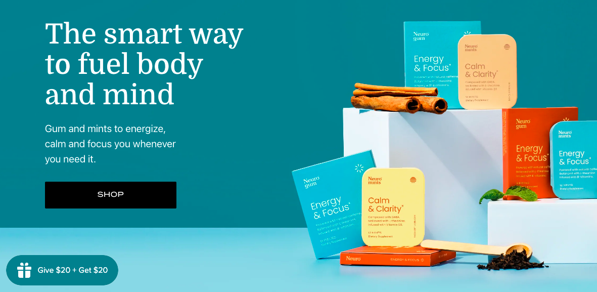
This Neuro Gum homepage nails the “first impression” test. It instantly shows what the product is, why it matters, and how you’ll benefit — all before scrolling.
Marketing Analysis
The clean layout directs your eye from the headline to the product to the action (that bold black “Shop” button). The headline makes a clear promise — “fuel body and mind” — then quickly explains how (gum and mints to energize or calm you).
Why It Works
- Big, benefit-focused headline answers “what’s in it for me?”
- Product photography builds trust and tangibility
- Color palette supports calm + energy theme
- One clear CTA keeps focus on conversion
Examples
- Apple: clean design, emotion-led copy, single CTA above the fold
- Magic Spoon: headline sells the benefit (“Childhood Cereal for Grown-Ups”)
- Calm: visuals and copy mirror the promise of relaxation
Analyzed by Swipebot
Loading analysis...
