Website Layout That Sells
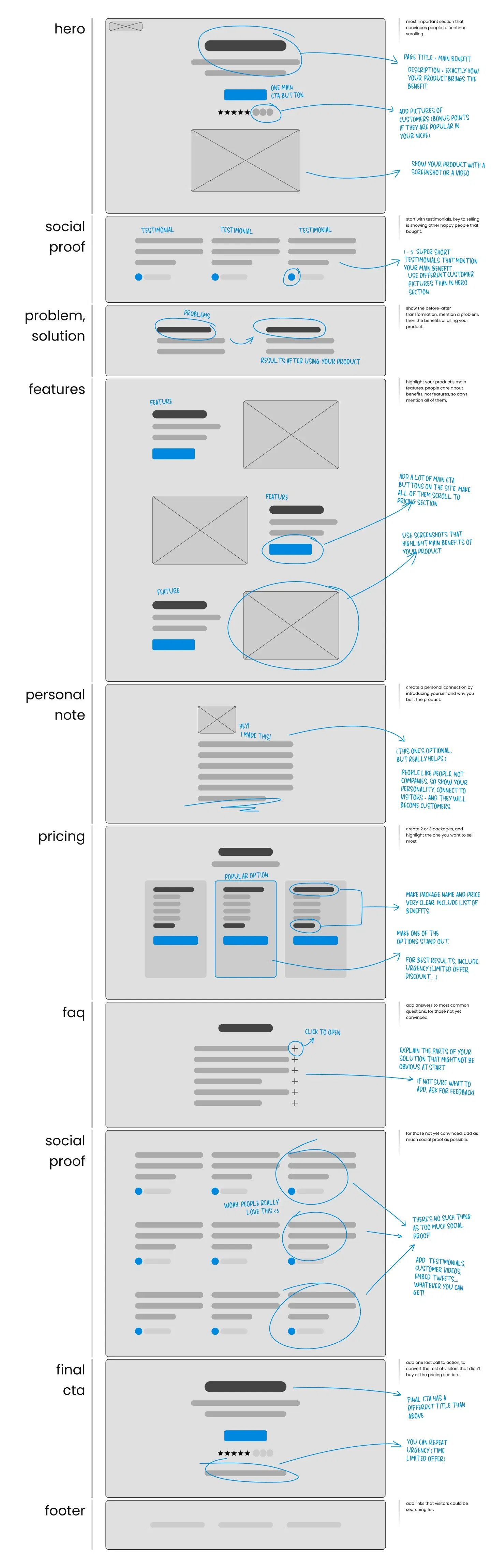
This mockup nails what every high-converting landing page needs. It’s a visual blueprint showing exactly which sections to include and where to place them for max impact.
Marketing analysis
It stacks persuasion in the right order: grab attention, prove credibility, explain value, show price, and close. Each section focuses on one psychological job — moving the visitor a little closer to “buy.”
Why it works
- Starts with a hero that sells the main benefit fast
- Uses social proof early and often
- Solves a clear problem before listing features
- Keeps CTAs consistent and visible
- Ends with a final reminder + testimonial
Examples
- Basecamp’s landing page opens with one-line clarity and a CTA
- Slack leads with testimonials from big-name brands
- Notion’s pricing layout mirrors this structure exactly
- Figma highlights problem-solution before showing features
Analyzed by Swipebot
Loading analysis...
