Darebee Homepage
Updated on
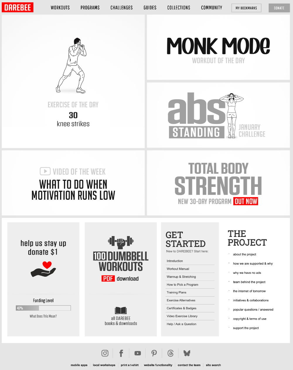
This homepage is a masterclass in clean, action-driven design. Darebee’s layout is simple, visual, and gets you moving fast—literally. No fluff, no flashy gimmicks, just a grid that makes you click and explore.
Why It Works
- Clear hierarchy: Every block has one job.
- Visual cues: Icons and bold text guide your eyes.
- Consistent design: Familiar structure builds trust.
- Minimal choices: Less thinking, faster action.
- High contrast: Red buttons = instant attention.
Examples
- Apple’s site uses bold visuals and white space to focus attention on key actions.
- Medium’s homepage highlights top picks instead of overwhelming users.
- Calm’s app dashboard uses simple categories to keep users engaged daily.
- Airbnb’s landing flow uses one big search bar that removes decision fatigue.
Analyzed by Swipebot
Loading analysis...
