Anatomy Of A High-Converting Homepage
Convert Sail dropped a killer visual that breaks down what makes a homepage actually convert. Spoiler: it’s not fancy animations — it’s structure and clarity.
Marketing Analysis
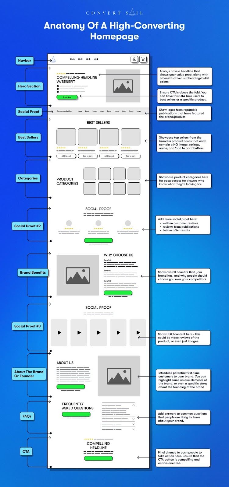
Every section of this layout does one simple job. It moves the visitor from “hmm, what is this?” to “yep, I’m buying.” Headlines with benefits, repeated social proof, and strategic CTAs keep attention and build trust fast. It’s basically a sales funnel disguised as your homepage.
Why It Works
- Clear headline delivers instant value
- CTA appears early (and often)
- Visual trust markers (logos, reviews, UGC) ease doubt
- Multiple entry points (best sellers, categories, FAQs) reduce friction
- Every scroll section has a conversion goal
Examples
- Shopify’s homepage shows UGC testimonials and global brand logos
- Casper highlights “Best Sellers” above the fold with 4.9-star ratings
- Dollar Shave Club mixes humor + social proof right under their hero video
- Allbirds gives benefits first, then brand story
- Slack leads with value: “Make work simpler, more pleasant, and more productive”
Analyzed by Swipebot
Loading analysis...
