Celsius can design rebrand
Updated on
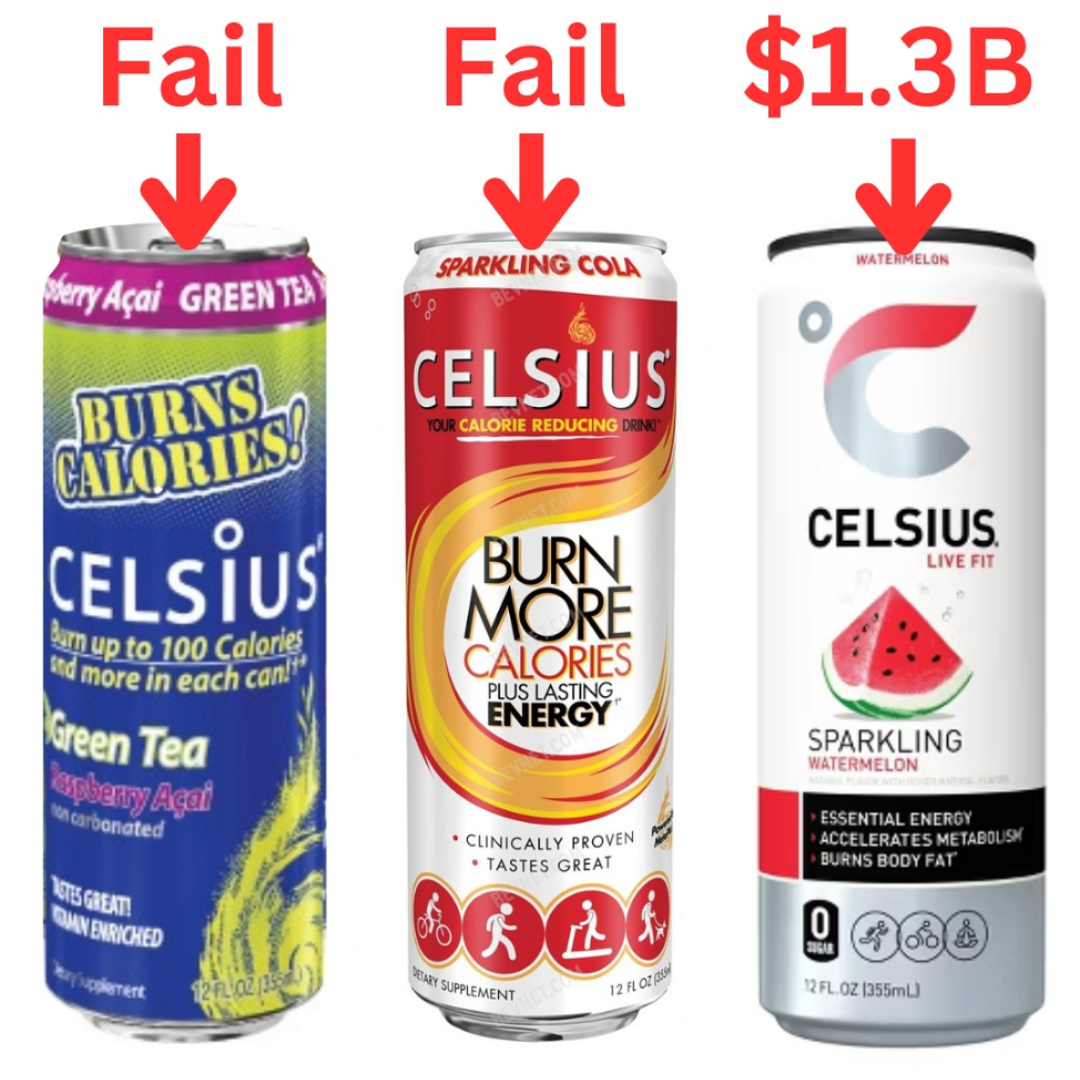
Celsius didn’t get it right the first (or even second) time. Their early cans screamed “diet drink” and “burn calories.” But when they simplified the look and shifted the message to “live fit,” sales exploded to $1.3 billion.
Marketing analysis
The old cans were cluttered with text and health claims. The new design screams “modern,” “healthy,” and “premium.” It focuses on identity, not features. Customers don’t want a metabolism boost—they want to be the type of person who drinks Celsius.
Why it works
- Simple, clean visuals cue health and trust
- Focus moved from product features to lifestyle identity
- Less copy = clearer message = faster decision
- Premium minimalism drives higher perceived value
Examples
- Liquid Death reframed canned water into a counterculture statement
- Oatly used bold, minimalist packaging to look “different” in a sea of dairy cartons
- Smartwater swaps cluttered design for clean labels and sells aspiration, not hydration
Analyzed by Swipebot
Loading analysis...
