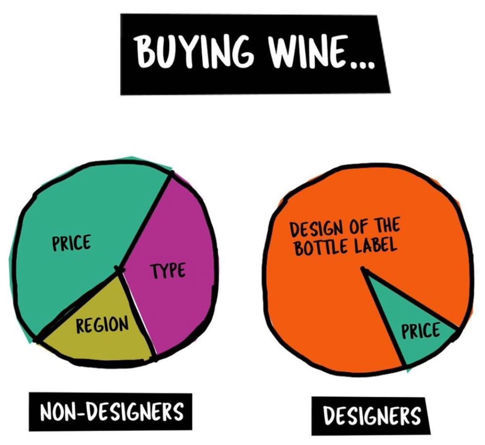
How Designers Buy Wine Pie Chart
Updated on

This clever visual nails how people view the same product through totally different lenses. Non-designers focus on price, type, and region. Designers? They’re all about the label.
Marketing analysis
The smart thing here is how simple it is. Two circles tell an entire story: your audience’s perspective dictates their buying decisions. Understanding that mental split is what separates okay marketing from great marketing.
Why it works
- Visual storytelling beats long explanations
- It’s instantly relatable (everyone buys wine)
- Highlights how branding influences purchasing
- Plays with contrast for humor and clarity
Examples
- Apple sells design emotion, not just specs
- Liquid Death water built a brand around edgy packaging
- Oatly’s cartons talk like people, not ingredients
- Dollar Shave Club won with wit, not razors
Analyzed by Swipebot
Loading analysis...
