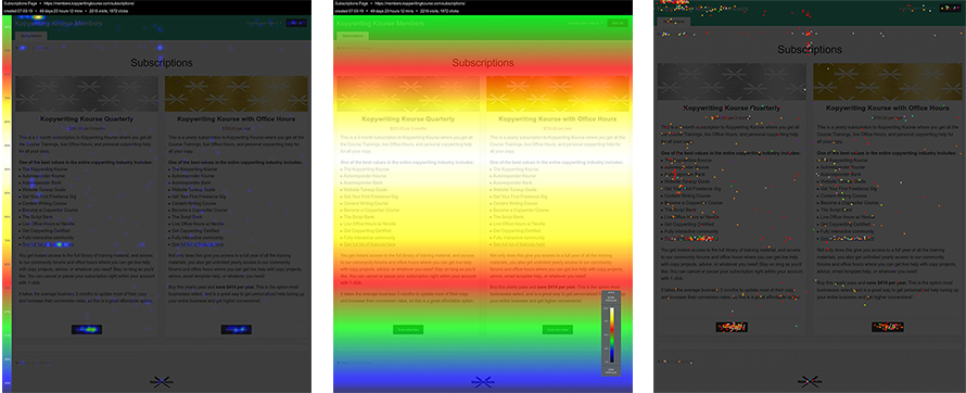
Kopywriting Kourse Subscription Page

Subscription Page Heat Map
Subscription Page Confetti Map
Subscription Page Scroll Map
Image Description
The image displays thumbnails of various maps (heatmap, confetti map, scroll map) related to the Kopywriting Kourse subscription page, providing visual data insights on user interaction and behavior.
Positive Aspects
The image effectively illustrates how users interact with the Kopywriting Kourse subscription page. By showcasing different types of maps (heatmap, confetti map, scroll map), it provides a visual representation of user focus areas, clicks, and scrolling behavior. This visual data is incredibly helpful for marketers and designers looking to optimize the signup form and enhance user experience.
Key Takeaways
- User Focus: Heatmaps reveal where users concentrate their attention, helping to identify the most and least engaging parts of the signup form.
- Click Behavior: Confetti maps show where users are clicking, which can highlight potential areas for improvement or confusion on the page.
- Scrolling Patterns: Scroll maps indicate how far users are scrolling down the page, shedding light on content that may not be reaching viewers.
- Optimization Opportunities: Analyzing these maps can guide changes to the subscription page to increase conversions and improve user experience.
- Data-Driven Decisions: Visual data from these maps helps make informed decisions about design and content placement.
Additional Insights
Ever wonder why some websites just seem to suck you in, while others have you hitting that back button faster than a sneeze? It's all about understanding user behavior, and these maps are like a treasure map for marketers. Imagine seeing where people hesitate or where they tap like they're trying to call an Uber. That's the kind of intel these maps offer. So next time you're tweaking a page, think of it like dressing for a date—put your best foot forward where it counts!


