Kopywriting Kourse Sales Page
Updated on
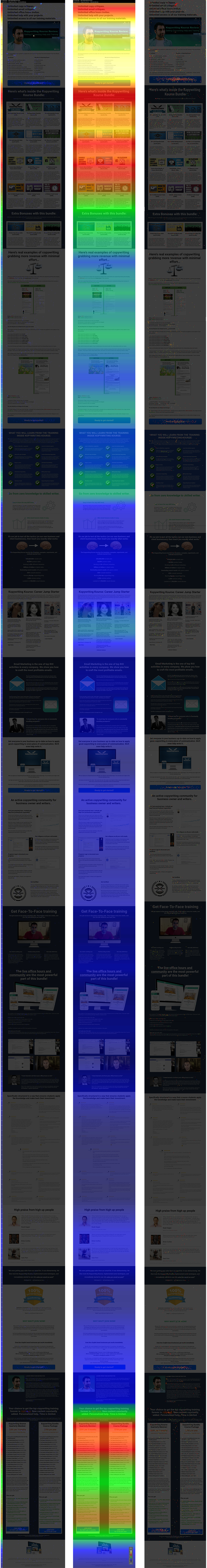
These heat maps from Kopywriting Kourse show exactly where users click, scroll, and stop paying attention. Instead of guessing what works, this data gives a visual x-ray of customer behavior.
What The Heat Maps Show
The top of the page is on fire. Most clicks happen around the headline, intro video, and first call-to-action. As users scroll down, attention cools fast — red to green to blue. The confetti map confirms the same: people click more when calls-to-action are clear and visible early.
Why This Works
- Above-the-fold = prime real estate for engagement
- Strong visuals (like videos or faces) grab attention
- Repeated CTAs keep conversion moments alive
- Clean design guides eyes down, not away
- Data cuts through opinion — the map never lies
Real-World Examples
- Crazy Egg saw 21% conversion lift after optimizing hot zones
- HotJar users often find footer CTAs convert <10% of clicks
- Amazon places “Add to Cart” buttons right where eyes linger most
- Basecamp keeps their signup above the fold — simple and seen
Analyzed by Swipebot
Loading analysis...
.png?width=3840&quality=80)