Kopywriting Kourse About Page
Updated on
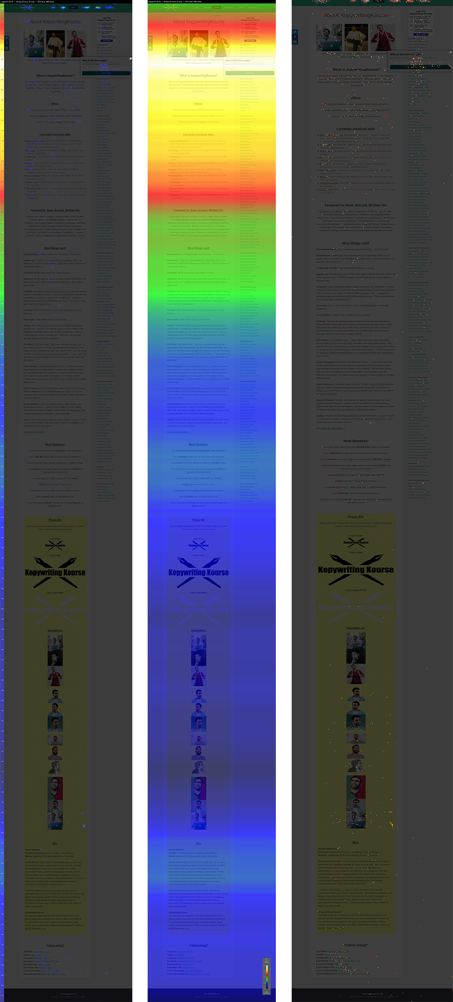
Most people treat their About Page like a resume. But these heat maps from Kopywriting Kourse show where visitors actually click, scroll, and drop off — turning guesswork into data-backed design.
Marketing analysis
The maps show heavy attention (red zones) up top around images and the short intro. After that, engagement fades fast. Most people never reach the “Press Kit” or bio sections. Translation: the top half of your page has to pull major weight.
Why it works
- Visitors decide in seconds if you’re worth reading.
- Visuals + short copy keep eyes glued longer.
- Clear subheads and bullet lists slow the scroll.
- CTAs near hot zones get way more clicks.
Examples
- Dropbox puts product purpose in the first screen.
- HubSpot’s About Page leads with an emotional mission, not a company history.
- Basecamp summarizes years of work in 3 short paragraphs.
- Duolingo uses fun visuals and humor to keep readers scrolling.
Analyzed by Swipebot
Loading analysis...
