KopywritingKourse Email Signup Form
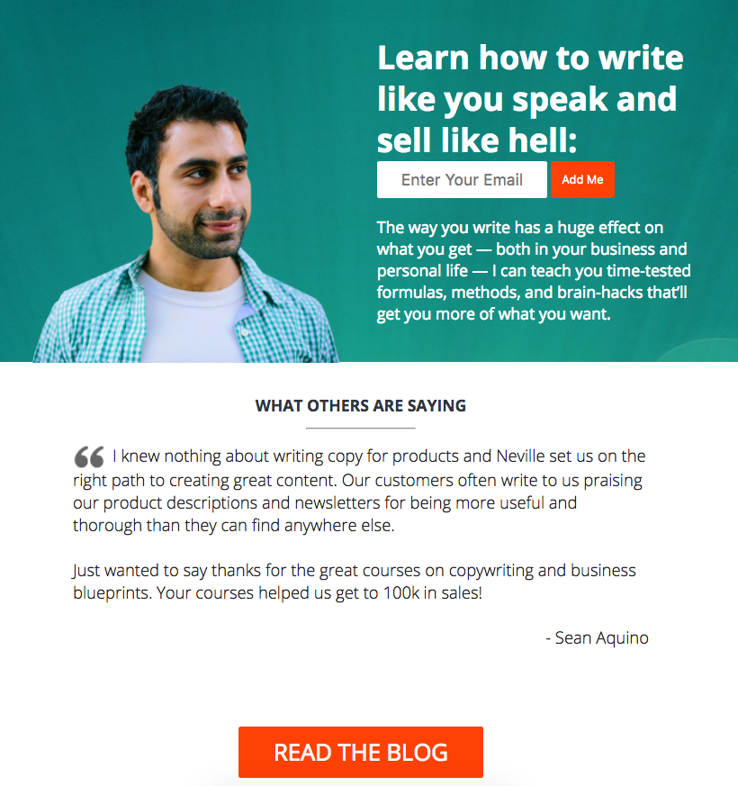
Neville Medhora’s signup form doesn’t just sit there—it talks to you. Literally. The man’s eyes on the page are pointed straight at the box where you’re supposed to type, which makes it feel personal and natural to respond.
Marketing Magic at Work
The design uses visual direction and friendly language to guide the reader’s next move. The result? It turns a basic form into a mini human encounter.
Why It Works
- Eye direction leads you right to the signup box
- Headline pops with clarity and confidence
- “Add Me” feels speedy and warm
- No clutter, no confusion—just action
Other Smart Examples
- Dropbox: “Sign up for free.” One line, one goal.
- Basecamp: Always one main button above the fold.
- Ramit Sethi: Uses conversational copy that sounds like a friend inviting you in.
Analyzed by Swipebot
Loading analysis...
.png?width=3840&quality=80)