SwipeFile.com Email Signup Split Test
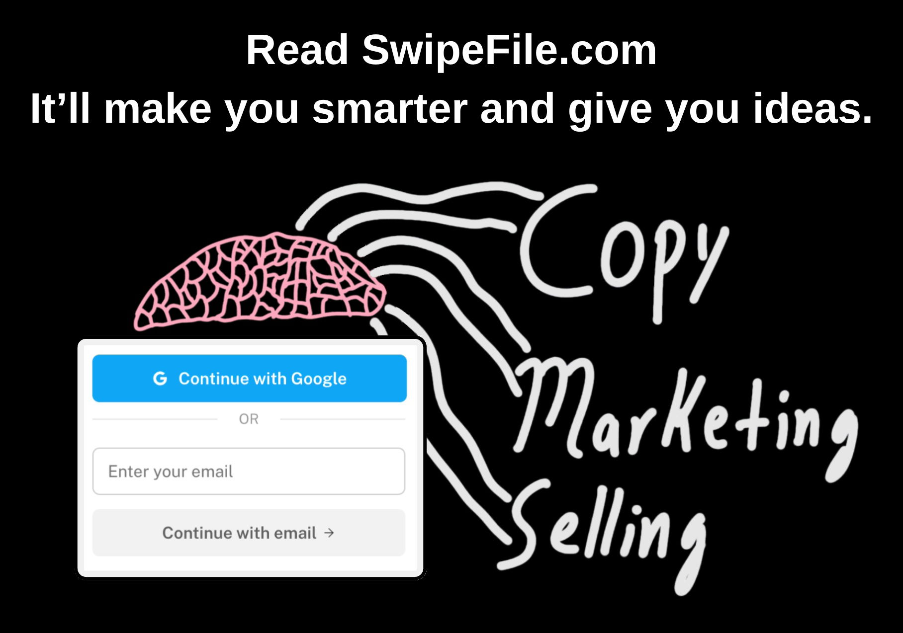
SwipeFile tested five versions of their email signup popup, and Version A crushed it with a massive 367% lift in signups. That’s the difference between 10 people out of 1,000 signing up vs. 46.
Why Version A Worked
- Clear benefit: “It’ll make you smarter and give you ideas” gives a brain-level reward.
- Simple visual: A bright brain sketch grabs attention fast.
- Direct CTA: No fluff, just clear next steps (“Continue with Google” or email).
- Contrast: Black background, white text — impossible to miss.
- Curiosity: Connects with marketers’ identity and ego in one line.
Real Examples
- Grammarly uses “Write with confidence” — same clear outcome-based hook.
- Morning Brew’s popup promises “Become smarter in 5 minutes.”
- Ahrefs Blog offers “Learn SEO from the pros” — practical + aspirational combo.
- Blinkist pushes “Big ideas in small packages.”
Simple, bold, and benefit-first always sells better.
Analyzed by Swipebot
Loading analysis...
