Pain Is Good Hot Sauce Package
Updated on
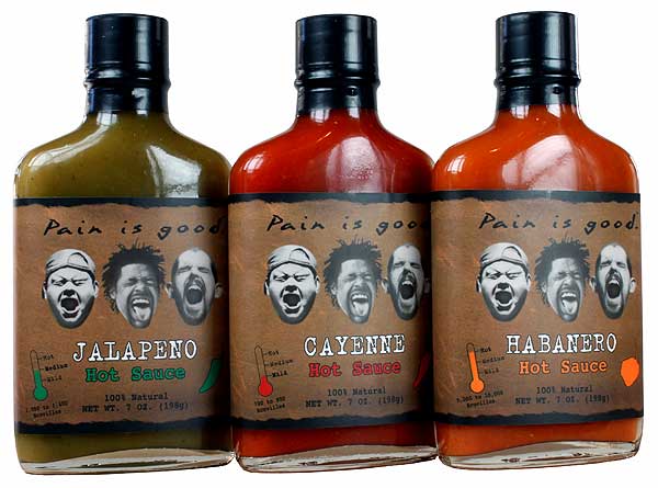
These bottles don’t whisper, they scream. Three faces mid-yell and a tagline that says it all: “Pain is good.” No extra copy needed—you already know this sauce won’t just be hot, it’ll hurt.
Marketing analysis
Everything about the packaging drives one feeling: intensity. The faces instantly tell the story. The brown kraft label adds an earthy, authentic vibe. The stripped-down design keeps focus on emotion, not polish. It’s primal, not pretty—and that’s the point.
Why it works
- Emotion sells faster than logic
- Faces show the product’s punch
- Every design choice reinforces “heat”
- Rustic packaging + bold tagline = instant memorability
Examples
- Liquid Death makes water feel rebellious
- Death Wish Coffee sells “the world’s strongest” cup
- Cards Against Humanity wins with shock and attitude
Analyzed by Swipebot
Loading analysis...
