Oatley Milk Before/After Branding
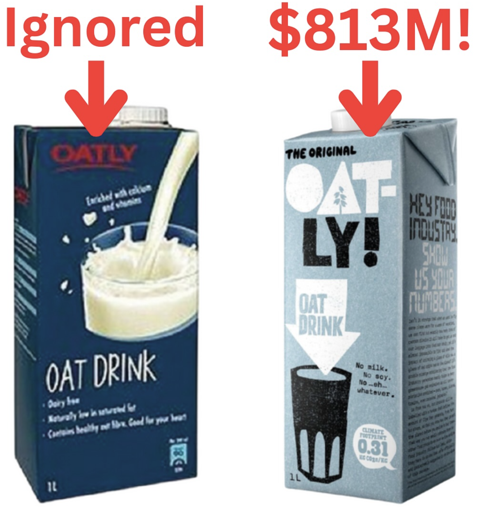
Oatly’s old packaging looked like every other “healthy” drink—plain, blue, boring. Then they flipped the script and built an identity that yelled, “We’re proudly dairy-free!”
Marketing Analysis
The new carton isn’t just design—it’s attitude. It speaks directly to non-dairy drinkers, calls out the old food industry, and builds a brand with personality. Oatly didn’t try to copy milk; they mocked it.
Why It Works
- Took a clear stance: not milk, just better.
- Built a visual identity that stood out on shelves.
- Used playful copy that made people smile.
- Turned packaging into a conversation starter.
Examples
- Liquid Death sold canned water by mocking energy drinks.
- Dollar Shave Club went bold with humor instead of “premium.”
- RXBar put ingredients front-and-center and reached $600M+ sale.
Analyzed by Swipebot
Loading analysis...
