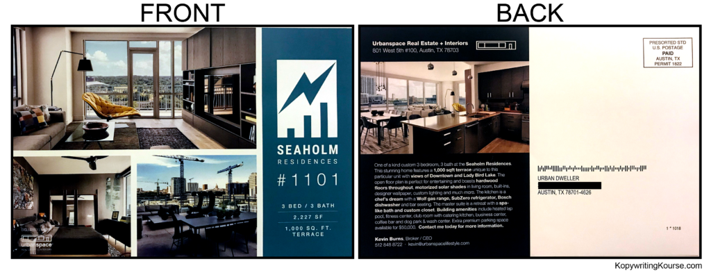
This Seaholm Residences flyer doesn’t just look nice—it’s a visual funnel for your eyeballs. Every design choice has a purpose: grab attention, guide flow, and keep you hooked till the call to action.
Marketing Analysis
Your eyes start on that bright, open living room. Then hop to the bold “#1101.” Then down through the kitchen shot. The logo and details keep you from wandering off. It’s not random—it’s designed attention flow.
Why It Works
- Big hero photo = instant magnet
- Contrast and layout = natural eye path
- Bold typography = locks key info
- Visual story = lifestyle before logistics
- Clean design = no distraction
Examples
- Zillow: lifestyle photos first, specs later
- Airbnb: bold sections highlight amenities
- Tesla: product shots, then features
Analyzed by Swipebot
Loading analysis...
