Adobe Brochure design template
Updated on
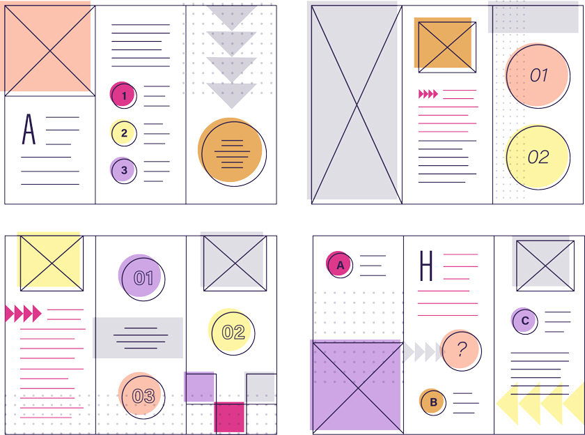
A great brochure doesn’t start with colors or photos. It starts with structure. This wireframe shows how marketers can plan their message before they design — keeping flow, hierarchy, and clarity in check.
Marketing Analysis
Each panel of the trifold plays a role: attract attention, share benefits, and drive action. The wireframe uses simple shapes and a clear visual path to mimic how a reader’s eye travels through a real brochure.
Why It Works
- Guides reader attention panel by panel
- Breaks complex info into digestible chunks
- Creates visual hierarchy using size and placement
- Makes design decisions easier once copy is set
Examples
- Apple product leaflets: crisp layout, focused messaging
- Airbnb travel guides: storytelling flow panel by panel
- Local gym brochures: strong CTA panel placement to drive sign-ups
Analyzed by Swipebot
Loading analysis...
