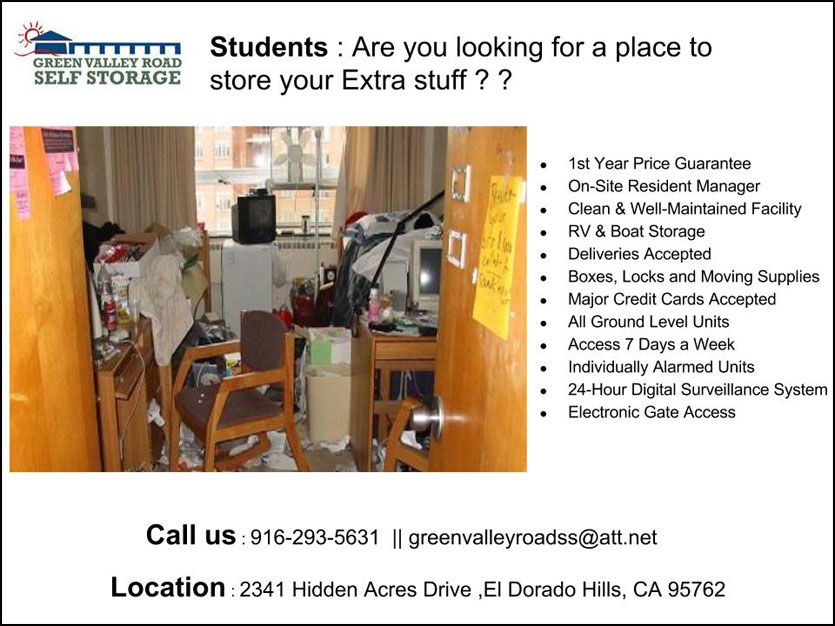
A good flyer grabs eyeballs fast. This student self-storage flyer does exactly that. The heatmap shows the reader’s eyes hit the headline, then the messy dorm photo, then the offer. That’s a perfect three-step story: problem, pain, and solution.
Why It Works
- Opens with “Students” to laser-target the audience
- Messy dorm image instantly triggers emotional context
- Short bullet list makes the benefits scannable
- CTA sits clearly at the bottom where eyes naturally land
- Follows the Z-pattern eye flow (top left to bottom right)
Real-World Parallels
- Dropbox: Simple homepages with visuals explaining the “why” fast
- Apple: Product pages lead your eyes from beauty shot to buy button
- Airbnb: Big emotional hero photos before the CTA for easy conversion
Analyzed by Swipebot
Loading analysis...
