Solar Energy Cost-Saving Graph
Updated on
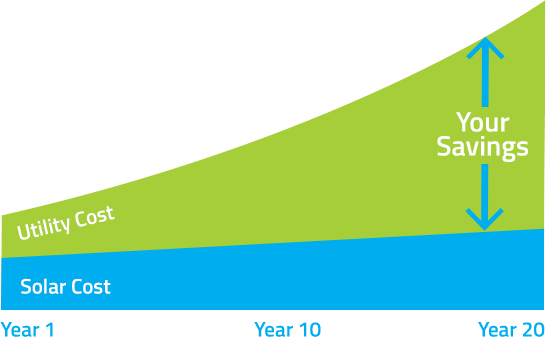
This image nails it. Two colored lines, one message: solar saves you money over time. No jargon, no tech talk, just pure wallet appeal.
Why this visual hits hard
- It instantly shows growing savings without needing words
- Contrasting colors make the message pop
- Focuses on one clear benefit: lower cost
- Leverages the "exponential" curve to hint at urgency and long-term value
Real-world plays
- Tesla’s solar calculator uses simple graphs to show lifetime savings
- Mint’s financial charts make users feel progress with color-coded visuals
- Slack’s usage reports use rising curves to show productivity gains
When one image tells your whole value story, your audience doesn’t just see the benefit—they feel it.
Analyzed by Swipebot
Loading analysis...
