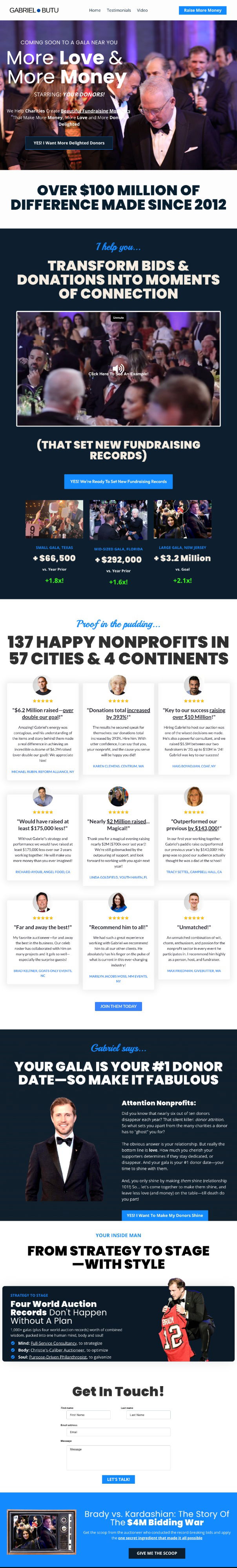
Solar energy home page mockup before and after

This before and after image is from a redesign tutorial in the Kopywriting Kourse.
It takes a sub-par hero section from a solar energy installation company's home page and turns it into a much stronger version.
Before, the hero section was:
- missing a clear message.
- missing a strong CTA.
- (and it was hard to read).
- a strong message highlighting the company's strongest selling points.
- a strong CTA that's obvious and easy to click.
- (plus, it just looks better and is easier to read).
Analyzed by SwipeBotSwipeBot
Image Description
The image shows a before-and-after comparison of a solar energy company's home page hero section. The "before" version has a cluttered design with a weak message, while the "after" version features a clear, bold message and a strong call-to-action button, making it more visually appealing and effective.
Positive Aspects
- Clarity and Focus: The redesigned hero section immediately grabs attention with a clear, bold headline. It succinctly communicates the company's top selling point.
- Effective Call-to-Action: The "Book a Call" button is prominent and inviting, encouraging user interaction.
- Improved Readability: The new design uses better contrast and spacing, making it easier to read and visually appealing.
Key Takeaways
- A strong, clear message is crucial for grabbing attention and conveying value.
- An obvious and easy-to-click call-to-action significantly boosts user engagement.
- Simplifying and improving readability can enhance the overall user experience.
Additional Insights
- Design Matters: Just like in solar panels, efficiency is key. A clear, focused design makes the website work harder for the business.
- First Impressions Count: The hero section is often the first thing visitors see. A compelling headline and CTA can quickly convert interest into action.
- User Experience Wins: By improving readability and design, you create a more pleasant experience, which can lead to higher conversion rates.