Spadge PDF Copywriting Portfolio
Updated on

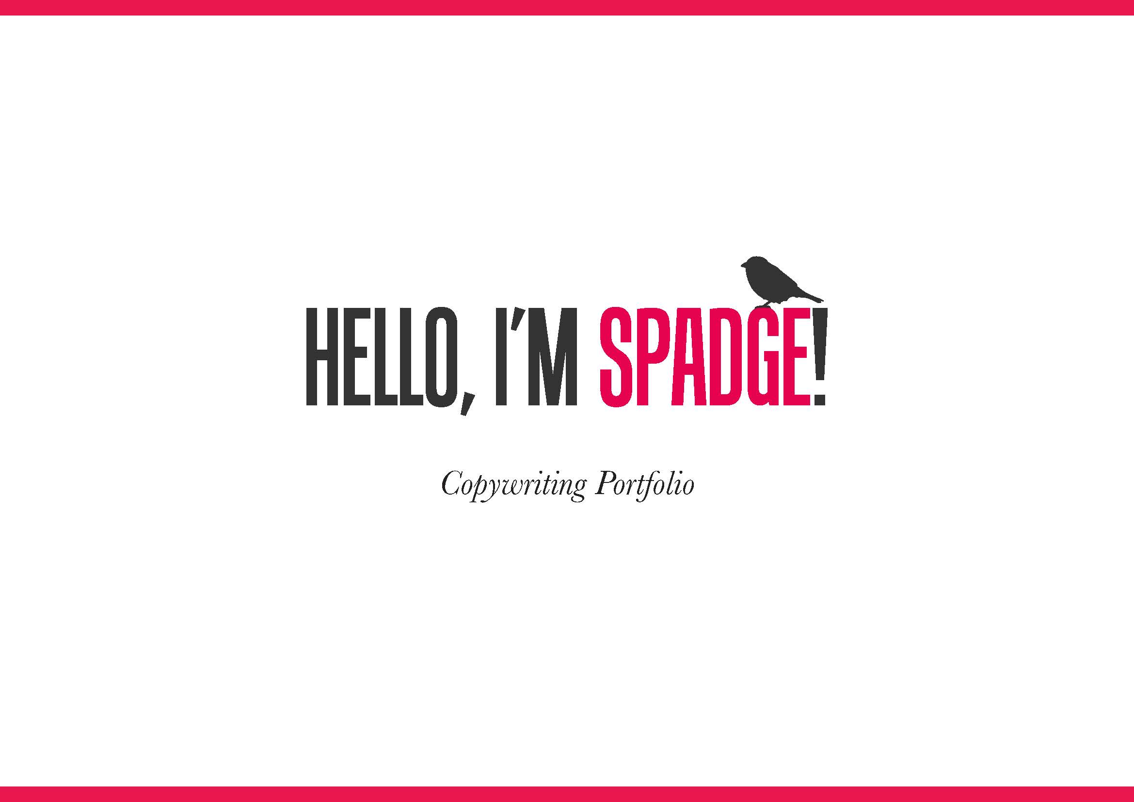
This portfolio intro by Spadge is a masterclass in “professional but memorable.” One glance and you know the vibe: clean, confident, creative. No clutter, no confusion, just clarity.
The Smart Design Moves
The bright red name grabs attention first. The minimalist white space gives your eyes room to breathe. The small bird graphic adds personality without trying too hard. You immediately get who the creator is—someone sharp and clever.
Why It Works
- Contrast + whitespace = instant focus
- One bold color makes the name unforgettable
- Visual hierarchy creates a smooth reading path
- A clear intro line sets the tone fast
Real-World Proof
- Dropbox’s homepage: minimal copy, one bold CTA
- Mailchimp: charming design with disciplined simplicity
- Apple’s brand pages: sleek restraint signals premium quality
Analyzed by Swipebot
Loading analysis...
