Before and after of product page
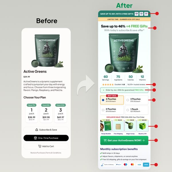
The “before” page looks clean but a little too plain. The “after” page screams value, urgency, and clarity. It’s packed with trust builders, bonuses, and visual cues that make you want to click buy now.
Marketing Analysis
Every piece of the redesign adds persuasion. The headline now promises savings and free gifts. There’s a countdown timer for urgency, visible social proof (4.8 stars), benefit highlights, and clear “best deal” framing with color contrast.
Why It Works
- Urgency drives faster action
- Bonuses make the offer feel richer
- Visual hierarchy guides attention
- Social proof builds trust instantly
- Clear CTAs reduce friction
Examples
- HelloFresh uses limited-time banners to boost signups
- Olipop shows star ratings near their “Add to Cart” button
- Pura Vida upsells bundle savings with bright “Best Value” badges
Analyzed by Swipebot
Loading analysis...
