CEO-to-Workers Pay Ratio
Updated on

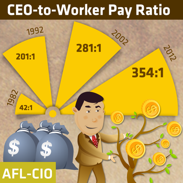
This AFL-CIO graphic turns dry income stats into something you actually want to look at. Instead of showing a spreadsheet of CEO pay, they used a bright, cartoonish chart that makes the message instantly clear: CEO pay has exploded.
Marketing analysis
The fan shape immediately shows growth over time. The bright yellow wedges pop off the screen. And that smiling cartoon CEO helps tone down the heaviness of “income inequality” without losing the point.
Why it works
- Uses shape to show time and expansion.
- Eye-catching color makes ratios readable instantly.
- Character illustration makes a tough topic friendly.
- Clean repetition drives the trend home.
Examples
- Spotify Wrapped visualizes listener data the same way—colorful and personal.
- Visual Capitalist nails this with economic infographics.
- HubSpot’s annual reports simplify marketing data into fun, digestible visuals.
Analyzed by Swipebot
Loading analysis...
