More personal power washing flyer
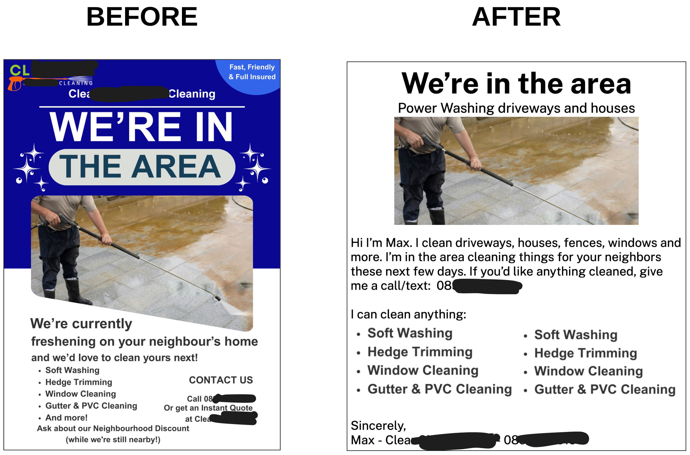
Here’s a great before-and-after ad makeover. The original looks polished but stiff. The new one looks like Max actually printed it himself and dropped it in your mailbox. Guess which one makes people call?
Why the “After” Works
- Feels like a note from a neighbor, not a business ad
- Removes corporate clutter and “template” design
- Uses simple, human language (“Hi, I’m Max…”)
- Builds instant trust with a name, phone number, and friendly tone
- Clarity beats clever design every time
Real-World Examples
- Handwritten lawn service flyers often get 2–3x response versus computer-generated ones
- Local realtors using “personal letters” instead of print templates see higher callbacks
- Roofers leaving casual notes (“Fixed your neighbor’s roof yesterday—need a quote?”) outperform glossy mailers
Analyzed by Swipebot
Loading analysis...
