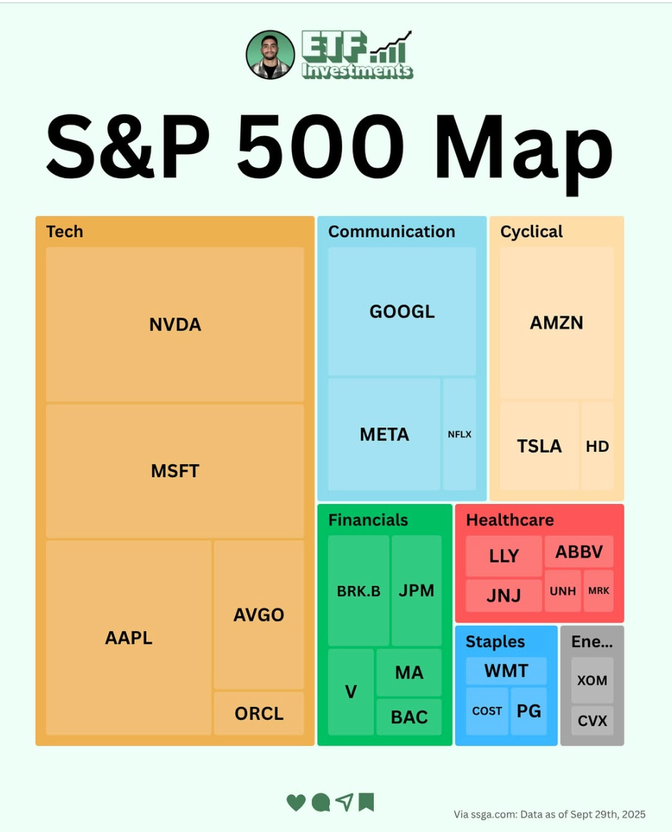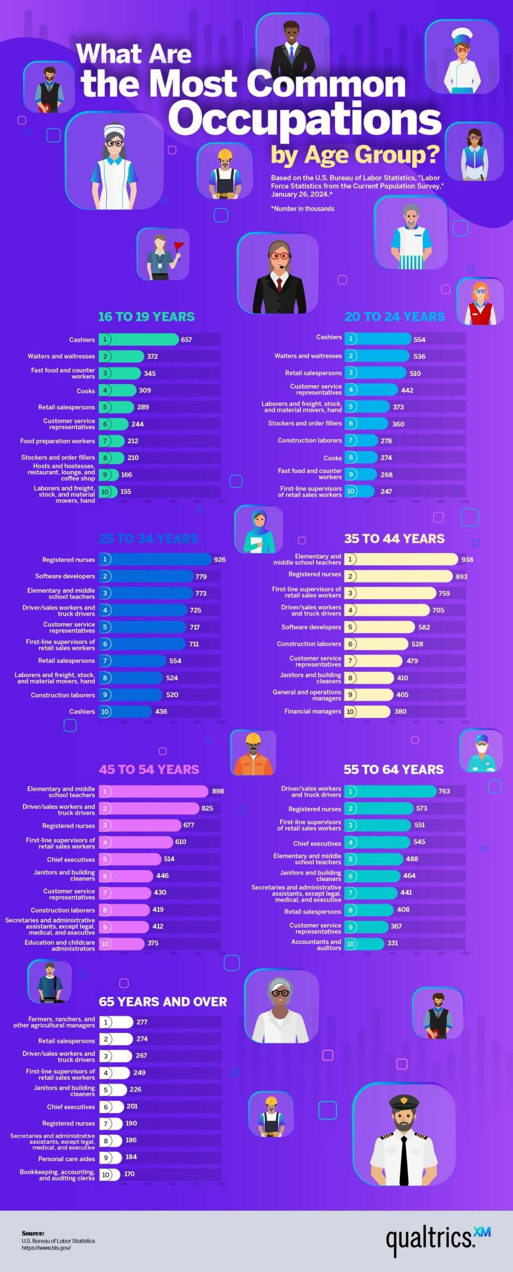
Ever wonder where your coffee money actually goes? This chart from Chartr packs a full economics lesson into one clever coffee cup image. It’s data storytelling at its tastiest.
Why This Visual Works
- Turns complex data into a fun, familiar shape (a coffee cup)
- Uses size and color to instantly communicate proportion
- Removes jargon—anyone can “feel” the meaning
- Anchors attention with something relatable: your daily latte
Real-World Wins
- Spotify Wrapped takes massive data and turns it into an easy-to-share story
- Apple’s “carbon neutral” visuals use icons and color to explain impact
- Airbnb Maps simplify endless listings into clean visual data layers
Simple shapes + smart data = instant understanding.


