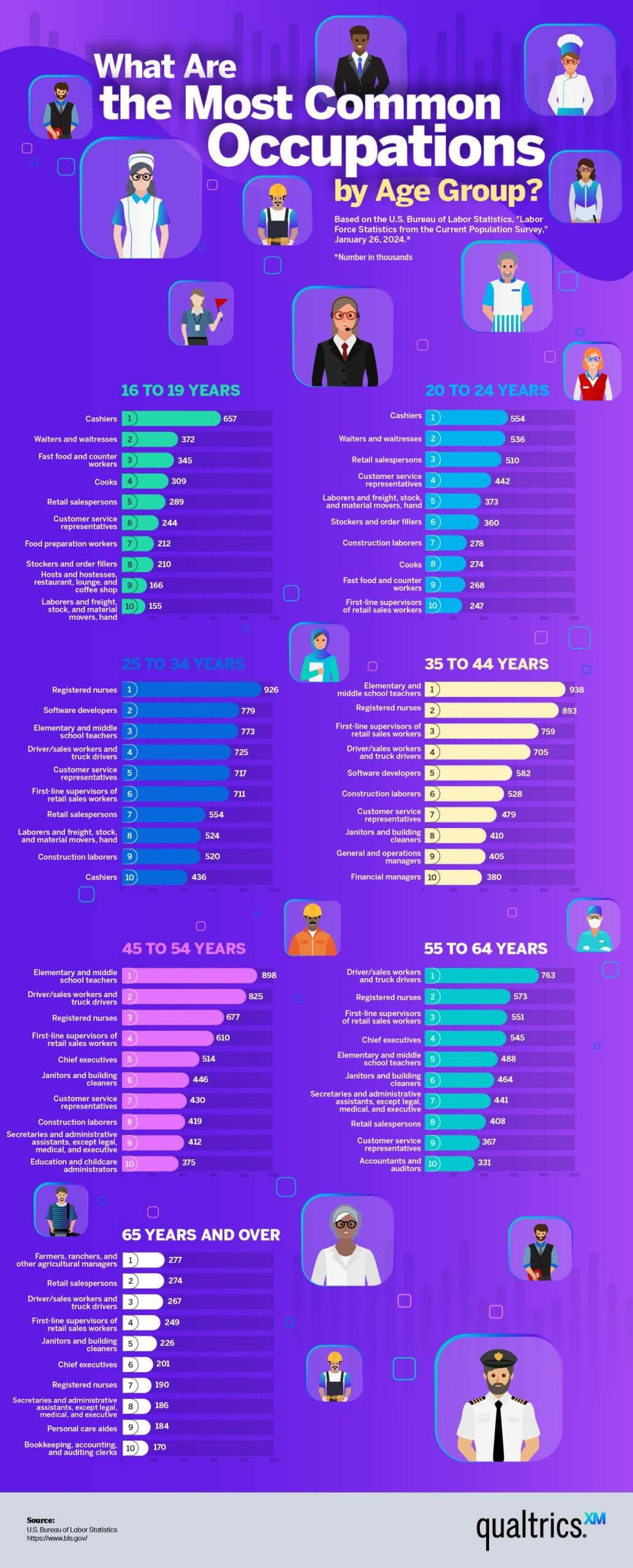
This infographic from Qualtrics shows the most common jobs by age group. From teen cashiers to elderly farmers — it doesn’t just show data, it tells a life story.
Marketing analysis
The design grabs you immediately: bold visuals, age-based sections, and clear color coding. It guides the eye naturally from youth to retirement, so you experience the data as a timeline of personal growth, not just numbers.
Why it works
- Grouped by age makes data meaningful and relatable
- Icons and colors make scanning fast and intuitive
- Each section tells a “mini story” of that phase of life
- Clear hierarchy keeps the infographic easy to digest
Examples
- Spotify’s “Wrapped” turns user data into personal stories
- LinkedIn’s “Job Trends” visuals show shifting skills over decades
- Google Trends’ “Year in Search” distills billions of searches into emotional moments
Analyzed by Swipebot
Loading analysis...
.png?width=3840&quality=80)