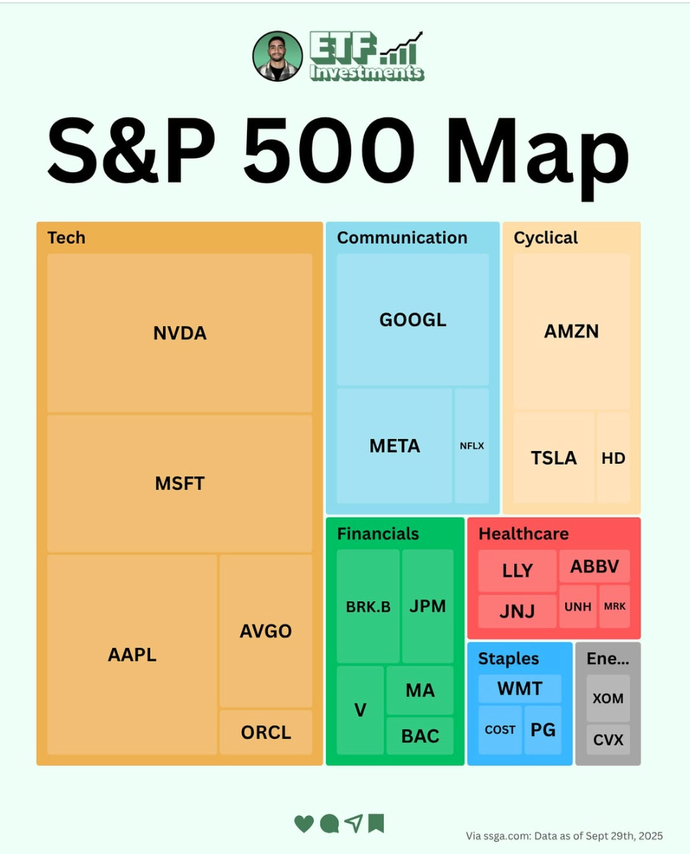
This graphic from ETF Investments nails visual communication. One glance and you instantly understand where the biggest players sit in the market. No words needed, just shape and color doing the heavy lifting.
Marketing Analysis
Each square shows market weight — big company, big square. The layout helps you see dominance rather than read about it. It’s like turning data into storytelling.
Why It Works
- Color contrast makes industries easy to spot
- Size instantly signals importance
- Minimal text reduces friction
- Perfect balance of design and data
Examples
- Spotify Wrapped: visualizes listening data with fun graphics
- Amazon’s “Best Sellers” chart: ranks products visually
- Google Trends: shows rising topics as colored bars
Creative Variations
Hand-drawn pen style
Classic 1950s print ad
Futuristic style
Funny style
Analyzed by Swipebot
Loading analysis...
