Coffee Ingredients Chart
Updated on
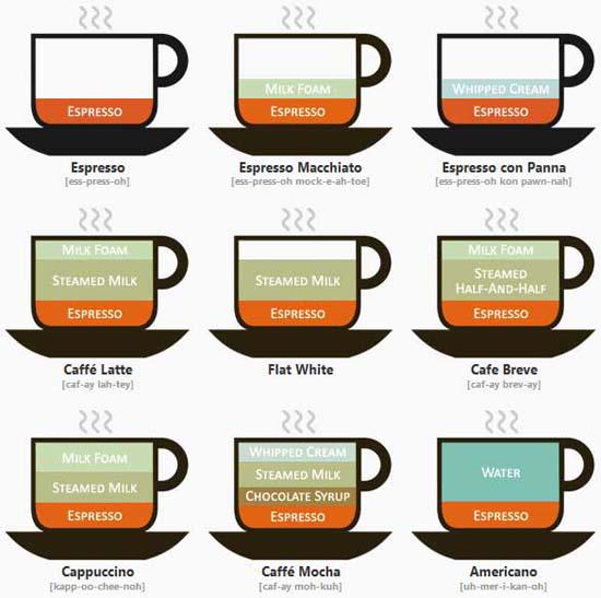
This coffee chart looks simple, but it’s a masterclass in branding and product differentiation. Every drink on here is basically espresso with varying amounts of milk, foam, or water — yet each one feels unique.
The Marketing Lesson
People don’t buy what you sell. They buy how it’s framed. Starbucks and every café in the world sell the same base ingredient, but they’ve turned simple ratios into entire product lines.
Why It Works
- Visual clarity creates instant understanding
- Names add personality and value (a “Flat White” sounds cooler than “Espresso + Milk”)
- Small variations = big menu expansion
- Feels custom, even when it’s standardized
Real-World Examples
- Apple sells the same iPhone with different storage sizes as totally separate models
- Coca-Cola spins one formula into Diet, Zero, Cherry, and Vanilla versions
- Nike Air Force 1s come in hundreds of colorways — same shoe, infinite styles
Analyzed by Swipebot
Loading analysis...
.png?width=3840&quality=80)