Forms of energy image
Updated on
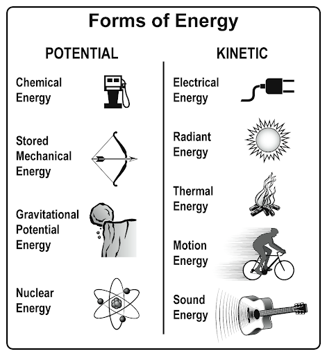
This chart of energy types is a simple masterclass in how to explain complex ideas. It takes a scientific topic—different energy forms—and turns it into a clean, visual comparison that’s easy enough for a fifth grader to get instantly.
Why it works
- Uses contrast: “Potential” vs. “Kinetic” draws clear categories.
- Simple icons make abstract ideas concrete.
- Plain text + minimal design = instant understanding.
- Organizes info vertically so your eyes can scan fast.
Real-world marketing examples
- Apple product charts: Compare Pro vs. Air models with simple visuals.
- Mailchimp’s pricing page: tiers side by side, easy to read.
- Canva tutorials: one visual explains steps better than paragraphs.
- HubSpot’s blog visuals: complex marketing funnels made dead simple.
Analyzed by Swipebot
Loading analysis...
