Good/Bad illustration for social login UI Design
Updated on
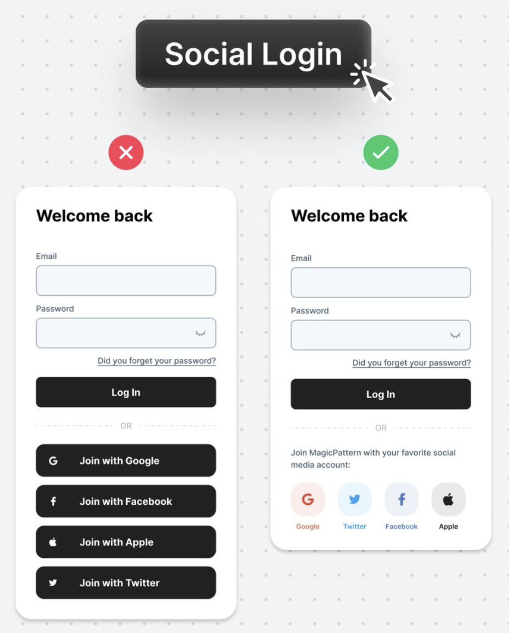
This side-by-side image nails it: one login form is cluttered and clunky, the other feels fresh and frictionless. Both serve the same purpose, but only one makes users actually want to sign in.
Marketing Analysis
The clean version simplifies decision-making. It trims extra text, swaps bulky buttons for lightweight icons, and adds friendly microcopy. Each element reduces friction, which equals more signups.
Why It Works
- Cognitive ease: Less to read, more to click.
- Visual hierarchy: Primary action (login) stays focal.
- Trust signals: Familiar brand icons reassure users.
- Simplicity sells: Clean design feels faster and safer.
Examples
- Airbnb and Spotify use sleek icons instead of heavy buttons.
- Dropbox saw a 10% signup boost after simplifying login options.
- Slack hides alternative logins under one concise prompt.
Analyzed by Swipebot
Loading analysis...
.png?width=3840&quality=80)