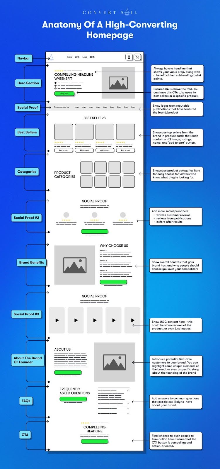
Homepage gives the user two options
Positive Aspects
- The title "Homepage gives the user two options" is intriguing and sets the stage for a focused discussion on user experience and design choices. It immediately grabs the reader’s attention by hinting at a decision-making element, which is a common challenge in web design.
Key Takeaways
Simplicity in Design: Offering two options on a homepage can simplify user navigation and help guide users towards the most important actions or information.
Focused User Journey: By limiting choices, the design encourages a more streamlined and deliberate user journey, potentially increasing conversion rates.
Decision-Making: Providing only two options can reduce user overwhelm and improve the decision-making process, making it easier for users to commit to an action.
Additional Insights
Think of a homepage with two options like a fork in the road. It’s much easier to choose between two paths than a dozen. This approach can be especially effective for businesses with two main customer segments or product categories.
Personal anecdote: I once redesigned a homepage for a client who sold both coffee and tea. By presenting visitors with just two options—"I love coffee" or "I love tea"—we saw a significant uptick in engagement. It turned out, people really appreciated not having to sift through a cluttered menu when they already knew their preference.
Humorously, it’s like the age-old question of "paper or plastic?"—keeping it simple and straightforward often leads to a happier customer experience.


