
To Rules of Marketing
A list of the 10 most important rules of marketing:1. Sell the benefits, not the features.2. Perfection is the enemy...

Cool growth Mario image
This cool image and headline go together really well and make for a playful and fun advertisement by showing Mario...

Market cap of BitCoin vs other assets
This shows just how small a market cap BitCoin currently has versus other assets.

GoHighLevel Software Comparison & Replacement Chart
This is a super cool chart that shows what GoHighLevel can replace. I love how this is displayed because it...

Interesting BitCoin meme for HODL’ing
I like this simple meme for BTC.

The Value Staircase Strategy
This chart shows how to earn trust before selling. Start with free content, then slowly offer more expensive products.

Funny Goal Update
Funny list that shows how goals shift. Great reminder that shows progress isn’t perfect.

Light bulb temperature lighting guide.
This is a very simple yet very cool guide that shows the difference between warm, neutral, cool, and cold lighting....

Use Images
Images make your emails more fun and easier to read.People’s eyes naturally gravitate towards images, eye tracking charts show this...

What Successful Marketing Actually Looks Like.
This chart perfectly captures the messy (but normal) journey for marketers.

Fun hand-drawn before and after
By adding a couple of little hand drawings in here, it made this ad stand out way more and grab...


Havnby Tesla Mattress Ad
I thought this was a cool ad showing a “transparent’ Tesla with the mattress being used. Very clever!

Massive Palantir.com Airport Banner
Big, bold, and impossible to miss. Palantir uses simple design and strong words to make a powerful statement.
.png?width=3840&quality=80)

How to Solve a Rubix's Cube Cheat Sheet
Clear one-page cheat sheet that walks you through solving a Rubik’s Cube step-by-step, with easy-to-follow, color-coded visuals.
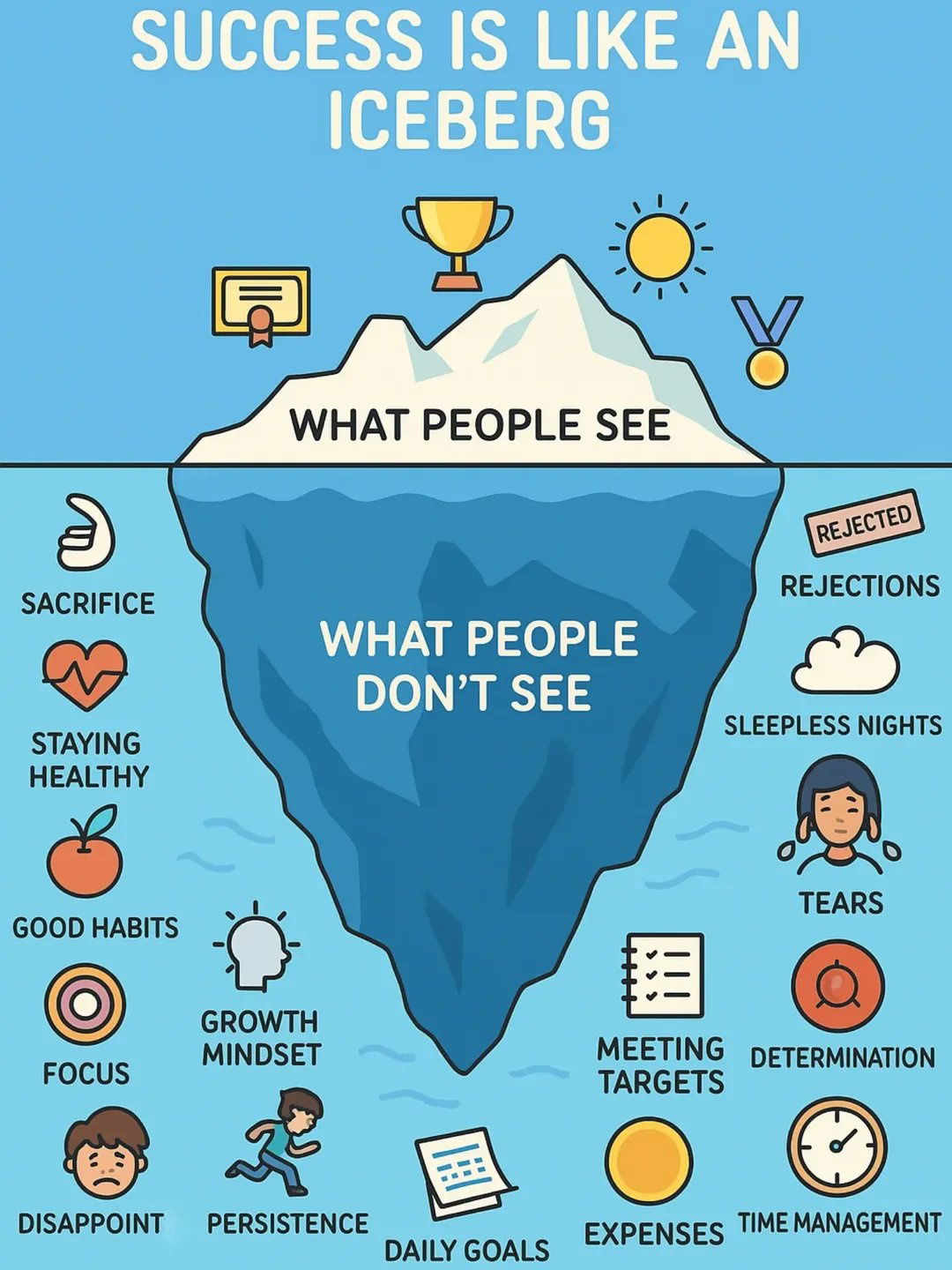
Success is like an iceberg.
It's easy to see someone's success and think it's easy, but then you don't see all the sacrifice, the hard...


What NOT to say in Marketing
This chart shows 8 boring phrases marketers use—and what to say instead to actually get clicks.

Zuckerberg’s 10 year roadmap from 2016 is totally on track
Having a longterm goal is very important.If you don't, you might just do random things that add up to nothing...

Automated chat booking on calendar
One of my biggest frustrations is going back and forth over text trying to schedule something. It's cool that AI...

Massive shift in economy over 30 years
This chart shows how American went from bringing in revenue from manufacturing in 1990 to bringing in revenue from healthcare...

Skinny Pop Packaging Redesign
SkinnyPop’s new look upset fans—but it’s a smart move. As culture shifts from “diet” to “flavor,” the brand updates its...

New York Tax Breakdown
This chart shows that the top 50% of New Yorkers paid 99.8% of income taxes in 2023.
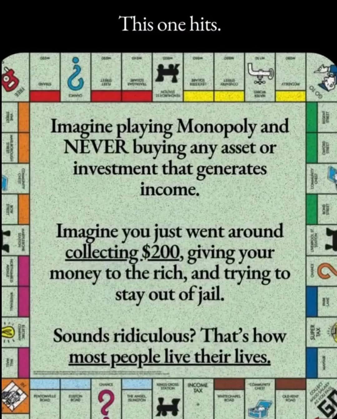
Life Lesson from Monopoly
Reminding the lessons learned from a childhood game. Clearly explains the importance of investing. It reads: "Imagine playing Monopoly and...
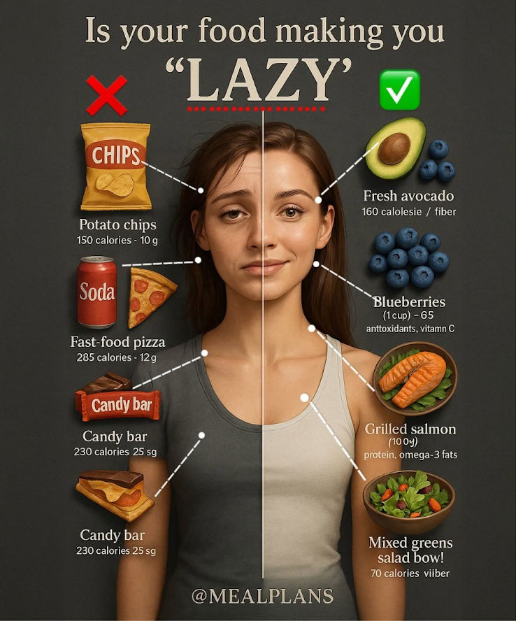
Is your food making you "LAZY" Infographic
Something about this image caught my eye (it kinda reminds me of a YouTube thumbnail).It shows the type of foods...
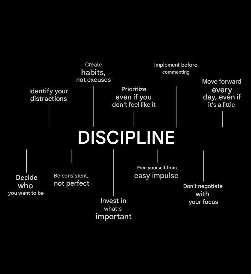
How Discipline Really Works
A simple breakdown of what discipline looks like in action—tiny daily habits, not big bursts of motivation.