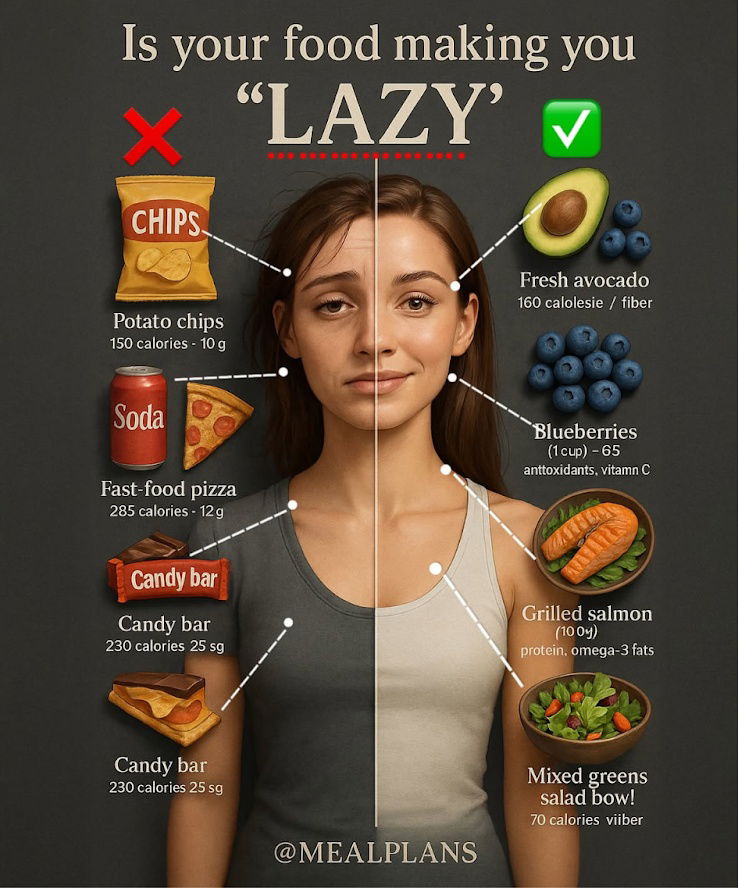
This image stops your scroll instantly. It’s split-screen perfection: lazy foods on one side, energetic foods on the other. You understand the message in one second flat. That’s powerful marketing design.
What Makes It Work
- Clear contrast: Visual opposites (and a human face) make it instantly understandable.
- Emotional hook: No one wants to be “lazy.” The word hits hard.
- Instant payoff: You don’t need to read anything to “get it.”
- Relatable topic: Everyone eats, everyone wants more energy.
- Authority vibe: The clean visuals + clear health claims = trust.
Similar Winning Formats
- Before/after photos in fitness ads
- Split-screen comparisons for cleaning products
- “What not to do” vs. “what to do” graphics on LinkedIn
- Face-in-the-middle contrasts in skincare brand posts
Analyzed by Swipebot
Loading analysis...
