Inflation Image
Updated on
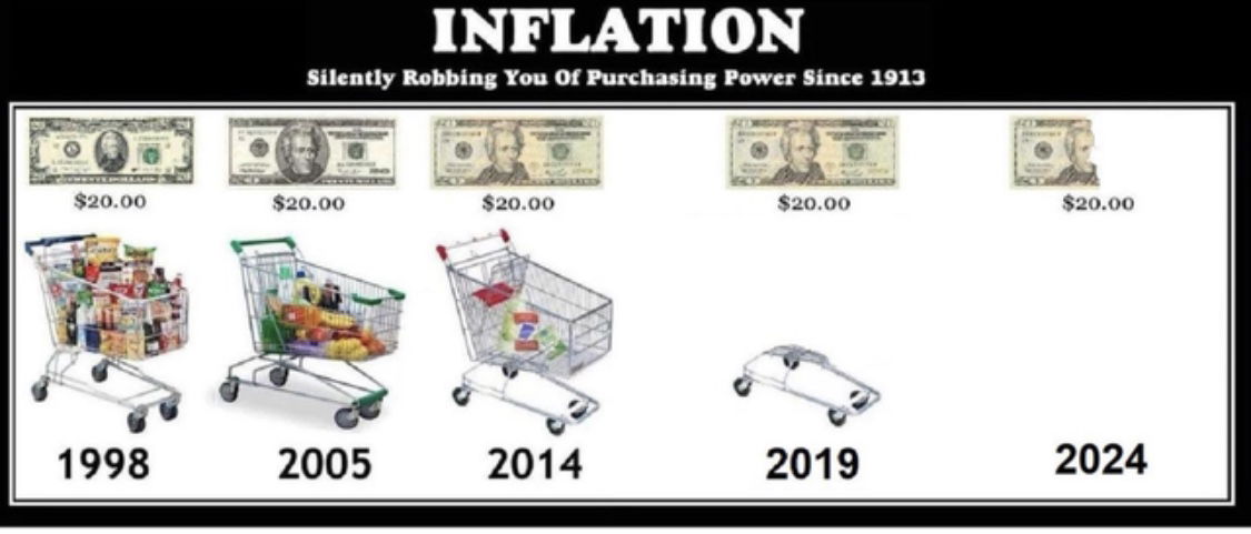
This image nails the concept of inflation in one glance. No charts. No jargon. Just five shopping carts getting more and more empty — and your brain gets it instantly.
Why This Visual Hits Hard
- It turns a complex concept into something everyone’s felt at the grocery store.
- The repetitive $20 bill creates an “aha” contrast.
- The visual story shows loss over time — pure emotional punch.
- There’s humor and exaggeration, but still truth.
Where You See This Trick in Action
- Coinbase simplifies crypto volatility with clean before/after charts.
- Wealthsimple uses lifestyle imagery to show compounding returns.
- Charity: Water shows how every dollar fills up a progress bar in real time.
- Apple compares products visually to highlight improvement year by year.
Analyzed by Swipebot
Loading analysis...